List
Displays a list of records of a data view, with options for grouping, filtering, viewing, editing and deleting records.
The List controller inherits from the BorderPanel, and by default it renders a built-in filter panel in its north region and a GridPanel in its center region. You can add other controllers in the other regions or override the center region if you want to add to or replace the grid with something else (say, a ChartPanel or the forthcoming MultiCardPanel. Currently you cannot override the north region if you use filters (see below).
Here is an example that display a grid and a chart inside an AccordionPanel:
Type: Data
Controller: List
  CenterController: AccordionPanel
    SubViews:
      Controller: GridPanel
        AllowClose: False
        ShowHeader: True
        ...
      Controller: ChartPanel
        AllowClose: False
        ShowHeader: True
        ...
Please note that you must set ShowHeader to True if you are using an AccordionPanel. Setting AllowClose to False is not required but usually preferred, as there's currently no way to reopen a closed tab or accordion subpanel.
For a different display, you could replace the AccordionPanel with a TabPanel and have the grid and chart in separate tabs. Or you could leave the grid (as per the default setting) in the center region and add the chart at the right:
Type: Data
Controller: List
  EastController: ChartPanel
    ...
Filters allow the user to apply search predicates to lists of records. The Filters/Items node has a set of subnodes, each of which represents a filter of a specified type. Each filter renders a user interface (a search box, a combo box, a set of buttons, etc.) and can build a Boolean SQL filter expression. Expressions are concatenated through a Connector (which can be "and" or "or" - default: "and").
Filter types are pluggable. Here is a list of current filter types provided with Kitto:
-
List: Displays a drop-down list of options, each of which has an associated expression which is used as the user selects the corresponding option. -
ButtonList: A set of buttons, each of which has an associated expression. The user can push multiple buttons, in which case expressions are combined through a specifiedConnector(default: "or"). -
FreeSearch: A free search box. Whether to search in one or multiple fields, and the type of search, depend on theExpression. The search is triggered when the user blurs the box (by hitting tab) or types in enough characters; the minimum can be set through theAutoSearchAfterCharsparameter. -
DynaList: A dynamic drop-down list, generated by a SQL select statement. -
DynaButtonList: A dynamic set of buttons, generated by a SQL select statement. -
DateSearch: Displays a drop-down calendar with an associated expression
Example of ButtonList filter:
Filters:
  DisplayLabel: Girls Filter
  Connector: and
  Items:
    ButtonList: Hair Color
      Items:
        All: All
          Expression: 1 = 1
          IsDefault: True
        Blond: Blond
          Expression: HAIR.HAIR_COLOR = 'Blond'
        Walnut: Walnut
          Expression: HAIR.HAIR_COLOR = 'Walnut'
        Black: Black
          Expression: HAIR.HAIR_COLOR = 'Black'
        Silver: Silver
          Expression: HAIR.HAIR_COLOR = 'Silver'
        Red: Red
          Expression: HAIR.HAIR_COLOR = 'Red'
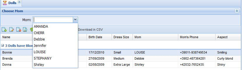
Example of DynaList filter:
Filters:
  DisplayLabel: Choose Mom
  Items:
    DynaList: Mom
      # CommandText - mandatory - must select the value field and
      # the display field as the first two fields.
      CommandText: |
        select GIRL_ID, GIRL_NAME
        from GIRL    {query}
        order by GIRL_NAME
      # ExpressionTemplate - mandatory - should contain a {value} placeholder
      # for the value field selected by the CommandText.
      ExpressionTemplate: DOLL.MOM_ID = '{value}'
      # QueryTemplate - mandatory to allow incremental search - should contain '{queryValue}%' -
      # it will be copied in {query} placeholder of Expression Template
      QueryTemplate: where GIRL_NAME like '{queryValue}%'
      # AutoCompleteMinChars: not mandatory - default is 4 characters - number of characters before incremental search starts
        AutoCompleteMinChars: 1
      # Combo width - not mandatory
        Width: 30
Example of DynaList filter with a where condition:
Filters:
  DisplayLabel: Choose employee
  Items:
      DynaList: Employee
        CommandText: |
          select EMPLOYEE_ID, EMPLOYEE_NAME
            from EMPLOYEE
            where EMPLOYEE_ID in (%Auth:ALLOWED_USERS%)    {query}
            order by EMPLOYEE_NAME
        ExpressionTemplate: {Q}EMPL like '{value}'
        QueryTemplate: and EMPLOYEE_NAME like '{queryValue}%'
Filters are applied to all contained controllers linked to the same ViewTable, meaning that if you have for example a grid and a chart, both are filtered and refreshed when you change filter criteria in the user interface.
Filters layout can be organized in colums. Simply add a ColumnBreak node to force column layout. You can also specify width of search items and width of space for labels.
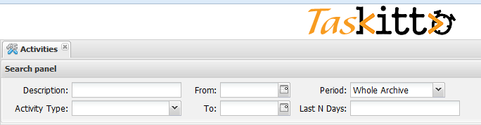
Example of a complex filter with column layout:
  Filters:
    DisplayLabel: Types
    LabelWidth: 90
    Connector: and
    Items:
      FreeSearch: Description
        ExpressionTemplate: (UPPER(Activity.Description) like UPPER('%{value}%'))
      DynaList: Activity Type
        Width: 20
        CommandText: |
          select first 1 '%' TYPE_ID, '(All)' TYPE_NAME from kitto_users
            union all
          select TYPE_ID, TYPE_NAME from ACTIVITY_TYPE
            order by 2
        ExpressionTemplate: Activity.TYPE_ID like '{value}'
      ColumnBreak:
        LabelWidth: 50
      DateSearch: From
        ExpressionTemplate: ACTIVITY_DATE >= '{value}'
      DateSearch: To
        ExpressionTemplate: ACTIVITY_DATE <= '{value}'
      ColumnBreak:
        LabelWidth: 80
      List: Period
        Items:
          Today: Today
            Expression: (ACTIVITY_DATE > %DB.CURRENT_DATE%-1)
          LastWeek: Last Week
            Expression: (ACTIVITY_DATE <= %DB.CURRENT_DATE%) and (ACTIVITY_DATE >= %DB.CURRENT_DATE% - 7)
          CurrMonth: Current Month
            Expression: |
              EXTRACT(month FROM ACTIVITY_DATE) = EXTRACT(month FROM %DB.CURRENT_DATE%)
              and EXTRACT(year FROM ACTIVITY_DATE) = EXTRACT(year FROM %DB.CURRENT_DATE%)
          CurrYear: Current Year
            Expression: EXTRACT(year FROM ACTIVITY_DATE) = EXTRACT(year FROM %DB.CURRENT_DATE%)
          All: Whole Archive
            Expression: 1=1
            IsDefault: True
      FreeSearch: Last N Days
        ExpressionTemplate: ACTIVITY_DATE >= (getDate() - {value})
See the documentation for GridPanel, ChartPanel and other data panels for more details