Form
Displays a single record of a data view. It is usually called by a List controller when the user selects a record to view or edit, or creates a new record, but it can be used in stand-alone manner in special cases, such as insert-only forms, or editing data in single-record tables.
The form controller renders a form panel with an editor for each field in the (main) view table; it can also show tabs or buttons for detail datasets. In read-write mode, it also features confirm and cancel buttons, whereas in read-only mode it has a close button only.
As mentioned above, each view table field generates an editor. The type of editor depends on the field's data type. For example, a date field features a popup date picker, a Boolean field a checkbox, a Reference field a combo box, and so on. Editor types are pluggable, so new editor types can be developed in Delphi/ExtPascal.
Editors are laid out vertically in the (scrollable) form panel, unless a layout definition is provided.
Layouts are yaml files stored under Metadata\Views\Layouts, and by default they are searched for using a naming convention. A layout called <ViewName>_Form.yaml is automatically used by the Form controller to render a view. You can also explicitly specify a layout (useful for sharing layouts among similar views) in the Controller/Form/Layout parameter. A layout allows you to tweak:
- Which fields are visible and in what order.
- How fields are laid out in rows and groups.
- Field labels and widths.
Fields in a layout can be put inside containers. First-level objects (fields or containers) are laid out vertically by default.
Currently available containers include:
-
FieldSet: surrounds fields with a border that may have a caption and a collapse/expand button. Options:-
LabelWidth: Sets the width in pixels for the labels (in case they are aligned to the left or right, as opposed to the top). -
Collapsible: Displays a collapse/expand button. -
Collapsed: Displays the box initially collapsed (only the label is visible).
-
-
Row: Lays out fields in a row instead of vertically. -
CompositeField: likeRow, but with a common caption instead of a label for each field.
Some options are common to all containers (except CompositeField, which is not a real container):
-
Layout: Sets a custom ExtJS layout (such ascolumn,table, etc. See the ExtJS docs for details). -
ColumnWidth: Sets the relative width (a decimal value from 0 to 1) in case the object is contained in a container with a column layout (such as aRowcontainer). Use this option to fine-tune the relative widths of objects in a container). -
CharWidth: Sets the object width in characters. -
Width: Sets the object width in pixels. -
Anchor: Sets ExtJS anchors. See the ExtJS docs for details.
A container can contain fields or other containers (for example,it is common for a FieldSet to contain Rows).
There are options you can set globally, as first-level nodes in the layout yaml file:
-
MemoWidth: Default width in characters for memo fields (default: 60). -
MaxFieldWidth: Sets a constraint for maximum field width in characters (default: 60). -
MinFieldWidth: Sets a constraint for minimum field width in characters (default: 5). -
RequiredLabelTemplate: A template string to format labels for required fields. May contain HTML code (default:<b>{label}*</b>, which means display the field's label in boldface and then a*character). -
MsgTarget: Indicates where the validations messages go:-
Qtip: As pop-up Qtips (default). -
Title: As field title (usually displayed as a pop-up hint by the web browser). -
Under: As tiny writings under each field. -
Side: At the field's side.
-
-
LabelWidth: Sets the width in pixels for the labels (in case they are aligned to the left or right, as opposed to the top). Labels are rendered to the left of the fields, in a column that isLabelWidthpixels wide. -
LabelAlign: Sets where the labels are aligned into the left column of the fields:-
Right: This is the default setting when no layout is used. -
Top: Each label is on top of the corresponding field, andLabelWidthis ignored. This is the default setting when a layout is used. -
Left: LikeRightbut labels are left-aligned.
-
-
LabelSeparator: A string appended to the labels (default: ": "). -
LabelPad: The distance in pixels between the labels (only forLeftandRightalignments) and the fields (default: 5).
All fields support these options:
-
CharWidth: Sets the field width in characters. -
DisplayLabel: Sets the field caption. -
Width: Sets the field width in pixels. -
Anchor: Sets ExtJS anchors. See the ExtJS docs for details.
Some options are supported by specific kinds of fields:
-
Lines: Number of lines to display for memo fields (default: 5, unlessEditLinesis specified on the field). -
Resizable: Set this to True to make a combo box's drop-down list resizable by the user.
Everything you don't set at the layout level, is looked for at the view field or model level and synthsized if needed.
Finally, you can use a PageBreak node to cause the creation of a new page in the tab control that hosts the layout. All subsequent nodes are then created on the new page. Supply the page title as the node's value.
Here is an example of form layout:
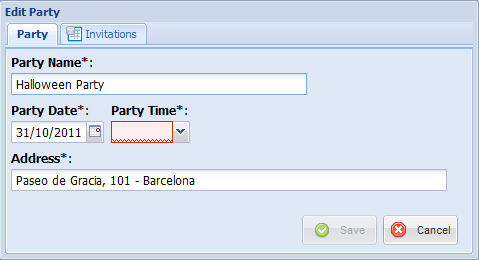
# layout Hellokitto parties_Form.yaml
Field: Party_Name
Row:
  Field: Party_Date
  Field: Party_Time
Field: Address
  CharWidth: 60
This example displays the fields in three rows, and sets a custom width for the Address field.
Another example:
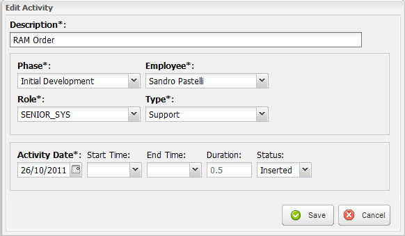
# Taskitto layout ActivityInput_Form.yaml
Field: DESCRIPTION
  CharWidth: 70
FieldSet:
  Row:
    Field: PHASE
    Field: EMPLOYEE
    Field: ROLE
    Field: TYPE
  Row:
    Field: ACTIVITY_DATE
    Field: START_TIME
    Field: END_TIME
    Field: DURATION
    Field: STATUS
Here we have two field sets (rendered as bordered boxes containing the field editors) of one row each.