GridPanel
The GridPanel is a DataPanelLeaf controller and as such inherits all its base class' capabilities. For example, you can put ToolViews in a GridPanel.
By default, the grid panel is used by the List controller as the main data display area and by the Form controller to display detail records. It consists of a standard data grid linked to a ViewTable (see DataView) and a toolbar with standard operations (such as add, view/edit, delete and refresh) and optional custom actions.
The grid may be either a plain grid or a grouped grid with a drill-down feature, as required.
The grid has a column for each field in the ViewTable it is linked to. The type of each column depends on the underlying field's data type.
You can add fields from referenced models through the dot syntax (ReferenceName.FieldName:), in which case you must also provide an alias to be used as field name (ReferenceName.FieldName: AliasName).
Example:
<ViewTable>:
  Fields:
    Id:
      IsVisible: False
    Name:
    Referenced.Name: RefName
Column order equals the order of view table fields, unless a layout definition is provided.
Grid layouts are yaml files stored under Metadata\Views\Layouts, and by default they are searched for using a naming convention. A layout called <ViewName>_Grid.yaml is automatically used by this controller to render a view's MainTable. You can also explicitly specify a layout (useful for sharing layouts among similar views) in the Controller/Grid/Layout parameter. Currently a grid layout is less powerful than a form layout, as it only allows you to tweak which fields are visible and in what order. Enhancements are planned.
Here is an example of a grid layout:
Field: DESCRIPTION
Field: PHASE
Field: EMPLOYEE
Field: ROLE
Field: TYPE
Field: ACTIVITY_DATE
Field: START_TIME
Field: END_TIME
Field: DURATION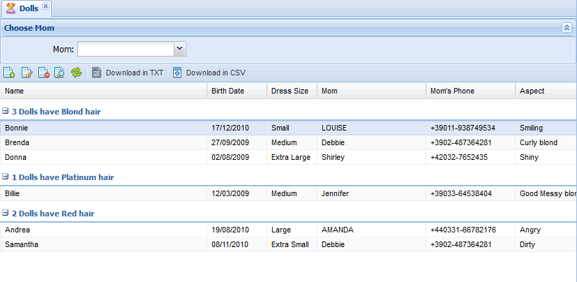
Field: STATUSThis feature allows you to display records in groups. You can define a grouping field, enable user-driven grouping, or customize the title of each group.
Single groups can be collapsed or expanded through a button on their header. When collapsed, a group only displays its title.
Groping here is different than grouping in SQL databases. In this case all records are retrieved anyway, not just aggregate values. In other words, grouping is performed by Kitto/ExtJS rather than the underlying database.
You enable grouping through properties under the <ViewTable>/Controller/Grouping subnode:
- FieldName: Name of the group field; you can group on any field, including an expression-based one.
- SortFieldName: By default, records are sorted on the grouping field name. By specifying this property, you can sort on a different field. A common use for this property is when you are grouping on a field containing a user-readable description and want to display groups in a specific order that is not the description's alpha order.
- EnableMenu: Enables a pop-up menu on each grid column that the user can use to group on arbitrary fields.
- StartCollapsed: Set to True for groups to appear initially collapsed; otherwise groups appear initially expanded.
- ShowName: If True, displays the grouping field's name (in addition to the value) in each group's summary line. Otherwise, only the value is displayed.
- ShowCount: Displays the count of group records in the summary. The count is rendered through a default template, that you can override through the
Templatesubproperty. Here is an example:
Grouping:
  FieldName: Hair
  ShowCount: True
    Template: {[values.rs.length]} Dolls have {text} hair
In the template, you use {text} to insert the group's default text (which may or may not include the field label, depending on ShowName, and does contain the field value) and snippets of Javascript code between {[ and ]}. In the Javascript code, values holds all the group records (accessible through the values.rs recordset).
Here is a more complex example:
Template: {text} (Events: {[countValues(values.rs, "REC_TYPE", "E")]} - Records: {[values.rs.length]})In this case the template calls a custom Javascript function, defined in Resources\js\application.js, that counts records with a given value for the "REC_TYPE" field. The rendered result is something like:
MyGroup (Events: 23 - Records: 30)
You can also use the special macros %ITEMS% and %ITEM% which expand to the plural and singular display labels of the model, which you can override through the subproperties ShowCount/PluralItemName and ShowCount/ItemName. The default template, as you can see below, uses both.
Default grouping template:
{text} ({[values.rs.length]} {[values.rs.length > 1 ? "%ITEMS%" : "%ITEM%"]})