
Basic structure needed to start building your web page. Add the tag, and an html element with a lang attribute of en.
Add a head element within the html element, so you can add a title element. The title element's text should be Cafe Menu.
The title is one of several elements that provide extra information not visible on the web page, but it is useful for search engines or how the page gets displayed. Inside the head element, nest a meta element with an attribute named charset set to the value utf-8 to tell the browser how to encode characters for the page. Note that meta elements are self-closing.
To prepare to create some actual content, add a body element below the head element.
The name of the cafe is CAMPER CAFE. Add an h1 element within your body element. Give it the name of the cafe in capitalized letters to make it stand out.
To let visitors know the cafe was founded in 2020, add a p element below the h1 element with the text Est. 2020.
Since the p element added in the previous step provides supplemental information about the cafe, nest both the h1 and p elements in a header element.
It's time to add some menu content. Add a main element below the existing header element. It will eventually contain pricing information about coffee and desserts offered by the cafe.
There will be two sections on the menu, one for coffees and one for desserts. Add a section element within the main element so you have a place to put all the coffees available.
Create an h2 element in the section element and give it the text Coffee.
Up until now, you have been limited regarding the presentation and appearance of the content you create. To start taking control, add a style element within the head element.
You can add style to an element by specifying it in the style element and setting a property for it like this:
element { property: value; } Center your h1 element by setting its text-align property to the value center.
In the previous step, you used a type selector to style the h1 element. Go ahead and center the h2 and p elements with a new type selector for each one.
You now have three type selectors with the exact same styling. You can add the same group of styles to many elements by creating a list of selectors. Each selector is separated with commas like this:
selector1, selector2 { property: value; } Delete the three existing type selectors and replace them with one selector list that centers the text for the h1, h2, and p elements.
You have styled three elements by writing CSS inside the style tags. This works, but since there will be many more styles, it's best to put all the styles in a separate file and link to it.
We have created a separate styles.css file for you and switched the editor view to that file. You can change between files with the tabs at the top of the editor.
Start by rewriting the styles you have created into the styles.css file. Make sure to exclude the opening and closing style tags.
Now that you have the CSS in the styles.css file, go ahead and remove the style element and all its content. Once it is removed, the text that was centered will shift back to the left.
Now you need to link the styles.css file so the styles will be applied again. Nest a self-closing link element in the head element. Give it a rel attribute value stylesheet and an href attribute value of styles.css.
For the styling of the page to look similar on mobile as it does on a desktop or laptop, you need to add a meta element with a special content attribute.
Add the following within the head element:
The text is centered again so the link to the CSS file is working. Add another style to the file that changes the background-color property to brown for the body element.
That brown background makes it hard to read the text. Change the body element's background color to be burlywood so it has some color but you are still be able to read the text.
The div element is used mainly for design layout purposes unlike the other content elements you have used so far. Add a div element inside the body element and then move all the other elements inside the new div.
The goal now is to make the div not take up the entire width of the page. The CSS width property is perfect for this. Create a new type selector in the style sheet that gives your div element a width of 300px.
Comments in CSS look like this:
/* comment here */ In your style sheet, comment out the line containing the background-color property and value, so you can see the effect of only styling div element. This will make the background white again.
Now use the existing div selector to set the background color of the div element to be burlywood.
Now it's easy to see that the text is centered inside the div element. Currently, the width of the div element is specified in pixels (px). Change the width property's value to be 80%, to make it 80% the width of its parent element (body).
Next, you want to center the div horizontally. You can do this by setting its margin-left and margin-right properties to auto. Think of the margin as invisible space around an element. Using these two margin properties, center the div element within the body element.
So far you have been using type selectors to style elements. A class selector is defined by a name with a dot directly in front of it, like this:
.class-name { styles } Change the existing div selector into a class selector by replacing div with a class named menu.
To apply the class's styling to the div element, add a class attribute to the div element's opening tag and set its value to menu.
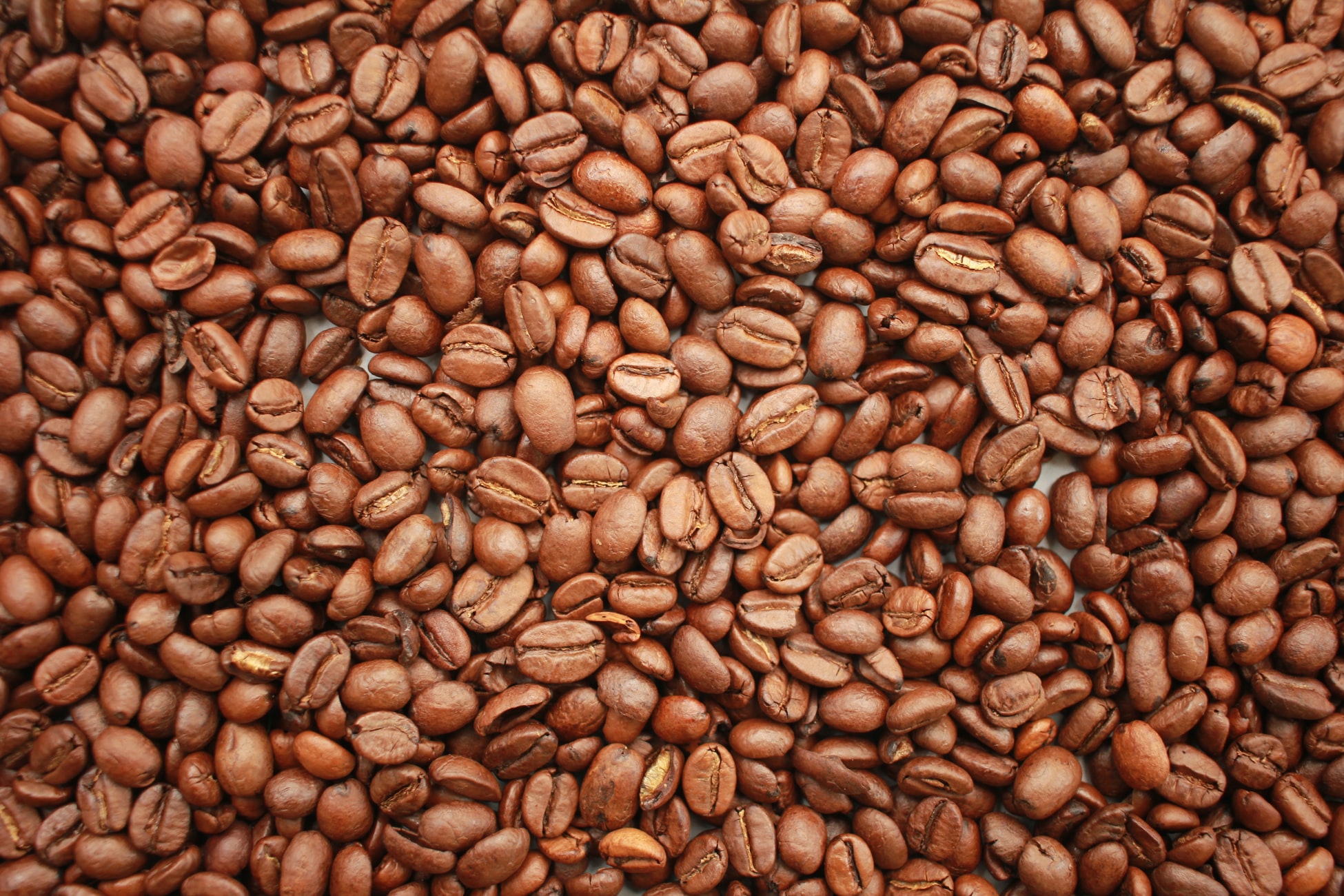
Since the cafe's main product for sale is coffee, you could use an image of coffee beans for the background of the page.
Delete the comment and its contents inside the body type selector. Now add a background-image property and set its value to url(https://cdn.freecodecamp.org/curriculum/css-cafe/beans.jpg).
It’s looking good. Time to start adding some menu items. Add an empty article element under the Coffee heading. It will contain a flavor and price of each coffee you currently offer.
article elements commonly contain multiple elements that have related information. In this case, it will contain a coffee flavor and a price for that flavor. Nest two p elements inside your article element. The first one's text should be French Vanilla, and the second's text 3.00.
Starting below the existing coffee/price pair, add the following coffee and prices using article elements with two nested p elements inside each. As before, the first p element's text should contain the coffee flavor and the second p element's text should contain the price.
Caramel Macchiato 3.75 Pumpkin Spice 3.50 Hazelnut 4.00 Mocha 4.50
The flavors and prices are currently stacked on top of each other and centered with their respective p elements. It would be nice if the flavor was on the left and the price was on the right.
Add the class name flavor to the French Vanilla p element.
Using your new flavor class as a selector, set the text-align property's value to left.
Next, you want to align the price to the right. Add a class named price to your p element that has 3.00 as its text.
Now align the text to the right for the elements with the price class.
That is kind of what you want, but now it would be nice if the flavor and price were on the same line. p elements are block-level elements, so they take up the entire width of their parent element.
To get them on the same line, you need to apply some styling to the p elements, so they behave more like inline elements. Add a class attribute with the value item to the first article element under the Coffee heading.
The p elements are nested in an article element with the class attribute of item. You can style all the p elements nested anywhere in elements with a class named item like this:
.item p { } Using the above selector, add a display property with value inline-block so the p elements behave more like inline elements.
That's closer, but the price didn't stay over on the right. This is because inline-block elements only take up the width of their content. To spread them out, add a width property to the flavor and price class selectors that have a value of 50% each.
Well that did not work. Styling the p elements as inline-block and placing them on separate lines in the code creates an extra space to the right of the first p element, causing the second one to shift to the next line. One way to fix this is to make each p element's width a little less than 50%.
Change the width value to 49% for each class to see what happens.
That worked, but there is still a little space on the right of the price.
You could keep trying various percentages for the widths. Instead, use the back space key on your keyboard to move the p element with the class price next to the p element with the class flavor so that they are on the same line in the editor. Make sure there is no space between them.
Now go ahead and change both the flavor and price class' widths to be 50% again.
Now that you know it works, you can change the remaining article and p elements to match the first set. Start by adding the class item to the other article elements.
Next, position the other p elements to be on the same line with no space between them.
To complete the styling, add the applicable class names flavor and price to all the remaining p elements.
If you make the width of the page preview smaller, you will notice at some point, some of the text on the left starts wrapping around to the next line. This is because the width of the p elements on the left side can only take up 50% of the space.
Since you know the prices on the right have significantly fewer characters, change the flavor class width value to be 75% and the price class width value to be 25%.
You will come back to styling the menu in a few steps, but for now, go ahead and add a second section element below the first for displaying the desserts offered by the cafe.
Add an h2 element in the new section and give it the text Desserts.
Add an empty article element under the Desserts heading. Give it a class attribute with the value item.
Nest two p elements inside your article element. The first one's text should be Donut, and the second's text 1.50. Put both of them on the same line making sure there is no space between them.
For the two p elements you just added, add dessert as the value of the first p element's class attribute and the value price as the second p elements class attribute.
Something does not look right. You added the correct class attribute value to the p element with Donut as its text, but you have not defined a selector for it.
Since the flavor class selector already has the properties you want, just add the dessert class name to it.
Below the dessert you just added, add the rest of the desserts and prices using three more article elements, each with two nested p elements. Each element should have the correct dessert and price text, and all of them should have the correct classes.
Cherry Pie 2.75 Cheesecake 3.00 Cinnamon Roll 2.50
You can give your menu some space between the content and the sides with various padding properties.
Give the menu class a padding-left and a padding-right with the same value 20px.
That looks better. Now try to add the same 20px padding to the top and bottom of the menu.
Since all 4 sides of the menu have the same internal spacing, go ahead and delete the four properties and use a single padding property with the value 20px.
The current width of the menu will always take up 80% of the body element's width. On a very wide screen, the coffee and dessert appear far apart from their prices.
Add a max-width property to the menu class with a value of 500px to prevent it from growing too wide.
You can change the font-family of text, to make it look different from the default font of your browser. Each browser has some common fonts available to it.
Change all the text in your body, by adding a font-family property with the value sans-serif. This is a fairly common font that is very readable.
It is a bit boring for all the text to have the same font-family. You can still have the majority of the text sans-serif and make just the h1 and h2 elements different using a different selector.
Style both the h1 and the h2 elements so that only these elements' text use Impact font.
You can add a fallback value for the font-family by adding another font name separated by a comma. Fallbacks are used in instances where the initial is not found/available.
Add the fallback font serif after the Impact font.
Make the Est. 2020 text italicized by creating an established class selector and giving it the font-style property with the value italic.
Now apply the established class to the Est. 2020 text.
The typography of heading elements (e.g. h1, h2) is set by default values of users' browsers.
Add two new type selectors (h1 and h2). Use the font-size property for both, but use the value 40px for the h1 and 30px for the h2.
Add a footer element below the main element, where you can add some additional information.
Inside the footer, add a p element. Then, nest an anchor (a) element in the p that links to https://www.freecodecamp.org and has the text Visit our website.
Add a second p element below the one with the link and give it the text 123 Free Code Camp Drive.
You can use an hr element to display a divider between sections of different content.
First, add an hr element between the first header element and the main element. Note that hr elements are self closing.Step 67Passed You can use an hr element to display a divider between sections of different content.
First, add an hr element between the first header element and the main element. Note that hr elements are self closing.
The default properties of an hr element will make it appear as a thin light grey line. You can change the height of the line by specifying a value for the height property.
Change the height of the hr element to be 3px.
Change the background color of the hr element to brown so it matches the color of the coffee beans.
Notice the grey color along the edges of the line. Those edges are known as borders. Each side of an element can have a different color or they can all be the same.
Make all the edges of the hr element the same color as the background of it using the border-color property.
Notice how the thickness of the line looks bigger? The default value of a property named border-width is 1px for all edges of hr elements. By changing the border to the same color as the background, the total height of the line is 5px (3px plus the top and bottom border width of 1px).
Change the height property of the hr to be 2px, so the total height of it becomes 4px.
Go ahead and add another hr element between the main element and the footer element.
To create a little more room around the menu, add 20px of space on the inside of the body element by using the padding property.
Focusing on the menu items and prices, there is a fairly large gap between each line.
Target all the p elements nested in elements with the class named item and set their top and bottom margin to be 5px.
Using the same style selector in the previous step, make the font size of the items and prices larger by using a value of 18px.
Changing the margin-bottom to 5px looks great. However, now the space between the Cinnamon Roll menu item and the second hr element does not match the space between the top hr element and the Coffee heading.
Add some more space by creating a class named bottom-line using 25px for the margin-top property.
Now add the bottom-line class to the second hr element so the styling is applied.
Next you are going to be styling the footer element. To keep the CSS organized, add a comment at the end of styles.css with the text FOOTER.
Moving down to the footer element, make all the text have a value of 14px for the font size.
The default color of a link that has not yet been clicked on is typically blue. The default color of a link that has already been visited from a page is typically purple.
To make the footer links the same color regardless if a link has been visited, use a type selector for the anchor element (a) and use the value black for the color property.
You change properties of a link when the link has actually been visited by using a pseudo-selector that looks like a:visited { propertyName: propertyValue; }.
Change the color of the footer Visit our website link to be grey when a user has visited the link.
You change properties of a link when the mouse hovers over them by using a pseudo-selector that looks like a:hover { propertyName: propertyValue; }.
Change the color of the footer Visit our website link to be brown when a user hovers over it.
You change properties of a link when the link is actually being clicked by using a pseudo-selector that looks like a:active { propertyName: propertyValue; }.
Change the color of the footer Visit our website link to be white when clicked on.
To keep with the same color theme you have already been using (black and brown), change the color for when the link is visited to black and use brown for when the link is actually clicked.
The menu text CAMPER CAFE has a different space from the top than the address's space at the bottom of the menu. This is due to the browser having some default top margin for the h1 element.
Change the top margin of the h1 element to 0 to remove all the top margin.
To remove some of the vertical space between the h1 element and the text Est. 2020, change the bottom margin of the h1 to 15px.
Now the top spacing looks good. The space below the address at the bottom of the menu is a little bigger than the space at the top of the menu and the h1 element.
To decrease the default margin space below the address p element, create a class selector named address and use the value 5px for the margin-bottom property.
Now apply the address class to the p element containing the address.
The menu looks good, but other than the coffee beans background image, it is mainly just text.
Under the Coffee heading, add an image using the url https://cdn.freecodecamp.org/curriculum/css-cafe/coffee.jpg. Give the image an alt value of coffee icon.
The image you added is not centered horizontally like the Coffee heading above it. img elements are "like" inline elements.
To make the image behave like heading elements (which are block-level), create an img type selector and use the value block for the display property and use the applicable margin-left and margin-right values to center it horizontally.
Add one last image under the Desserts heading using the url https://cdn.freecodecamp.org/curriculum/css-cafe/pie.jpg. Give the image an alt value of pie icon.
It would be nice if the vertical space between the h2 elements and their associated icons was smaller. The h2 elements have default top and bottom margin space, so you could change the bottom margin of the h2 elements to say 0 or another number.
There is an easier way, simply add a negative top margin to the img elements to pull them up from their current positions. Negative values are created using a - in front of the value. To complete this project, go ahead and use a negative top margin of 25px in the img type selector.
End.