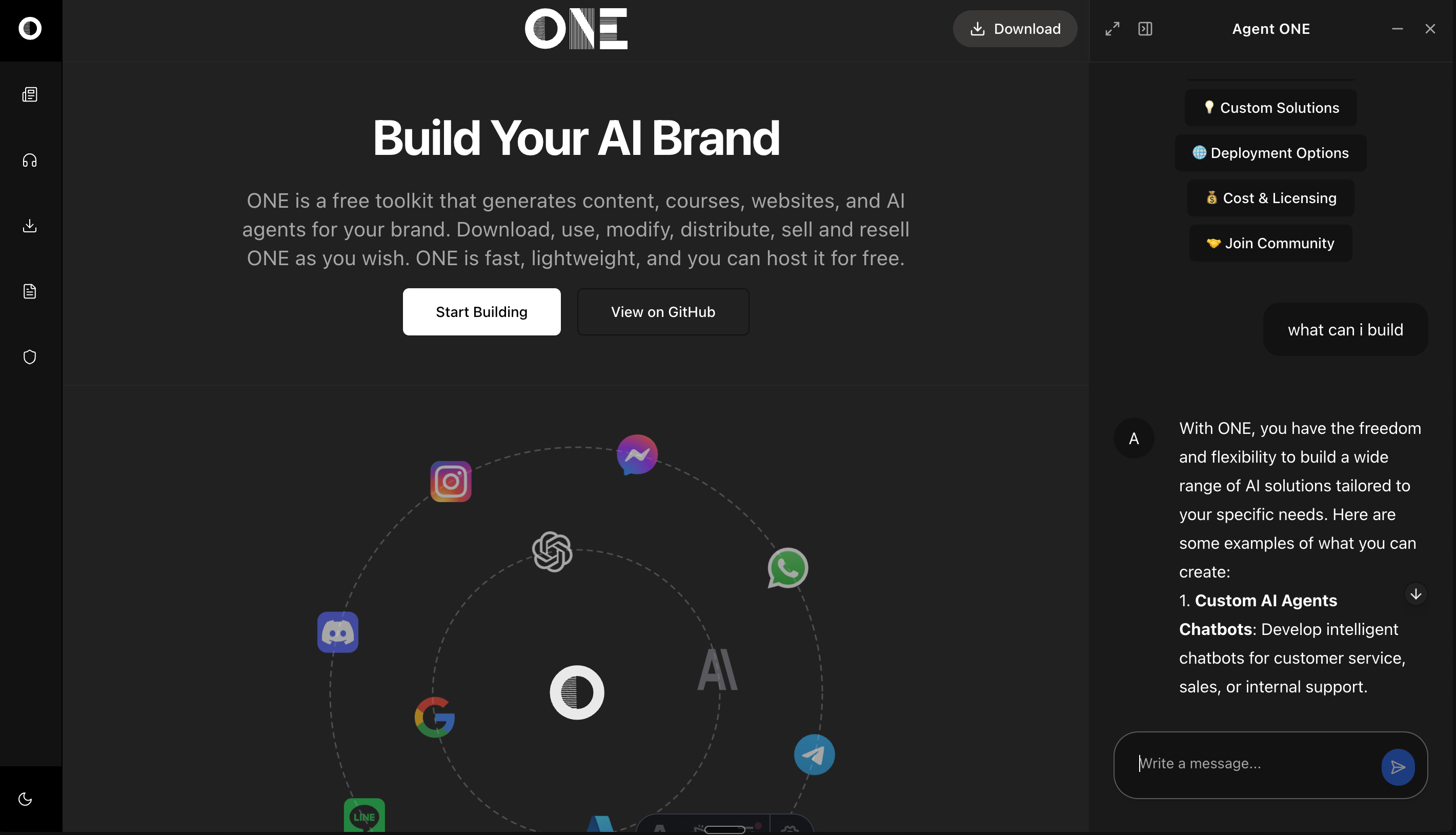
ONE is a modern web and AI agent development toolkit that combines the blazing-fast performance of Astro with the elegant components of Shadcn/UI. This enterprise-class starter kit empowers developers to build AI-powered applications with:
- ⚡ High Performance: Astro's partial hydration ensures minimal JavaScript
- 🎨 Beautiful UI: Pre-configured Shadcn components with full TypeScript support
- 🤖 AI Integration: Built-in tools for AI-powered features and automation
- 📱 Responsive Design: Mobile-first approach with Tailwind CSS
- 🔒 Type Safety: Full TypeScript support throughout the codebase
- 🛠️ Developer Experience: Hot reloading, intuitive project structure, and comprehensive documentation
Perfect for building modern web applications, from simple landing pages to complex AI-powered platforms.
This guide will help you set up and start building AI-powered applications with ONE. ONE combines Astro, React, and modern AI capabilities to create intelligent web applications.
Before you begin, ensure you have:
- Node.js 18 or higher installed
- pnpm package manager (
npm install -g pnpm) - An OpenAI API key (for AI capabilities)
- Basic knowledge of Astro and React
Choose your preferred way to get started with ONE:
📦 Option 1: Clone the Repository
git clone https://github.com/one-ie/one.git
cd one
💾 Option 2: Download ZIP
- Download the ZIP file: Download ONE
- Extract the contents
- Navigate to the project directory
🔄 Option 3: Fork the Repository
- Visit the Fork page
- Create your fork
- Clone your forked repository
Click the button above to instantly start developing in a cloud environment.
# Navigate to project directory
cd one

# Install dependencies
pnpm installMake a copy .env.example file in located at the top level of your project and call it .env
Add the keys to
OPENAI_API_KEY=your_api_key_herepnpm devVisit http://localhost:4321 to see your application running.
one/
├── src/
│   ├── components/     # UI components
│   ├── layouts/       # Page layouts
│   ├── pages/         # Routes and pages
│   ├── content/       # Markdown content
│   └── styles/        # Global styles
└── public/           # Static assets
- Create a new page (e.g.,
src/pages/chat.astro):
---
import Layout from "../layouts/Layout.astro";
import { ChatConfigSchema } from '../schema/chat';

const chatConfig = ChatConfigSchema.parse({
  systemPrompt: [{
    type: "text",
    text: "You are a helpful assistant."
  }],
  welcome: {
    message: "👋 How can I help you today?",
    avatar: "/icon.svg",
    suggestions: [
      {
        label: "Get Started",
        prompt: "How do I get started with ONE?"
      }
    ]
  }
});
---

<Layout
  title="Chat Page"
  chatConfig={chatConfig}
  rightPanelMode="quarter"
>
  <main>
    <h1>Welcome to the Chat</h1>
    <!-- Your page content here -->
  </main>
</Layout>const chatConfig = {
provider: "openai", // AI provider
model: "gpt-4o-mini", // Model to use
apiEndpoint: "https://api.openai.com/v1",
temperature: 0.7, // Response creativity (0-1)
maxTokens: 2000, // Maximum response length
systemPrompt: "...", // AI behavior definition
welcome: {
message: "...", // Welcome message
avatar: "/path/to/icon.svg",
suggestions: [...] // Quick start prompts
}
};The chat interface can be displayed in different modes:
quarter: 25% width side panelhalf: 50% width side panelfull: Full screen chatfloating: Floating chat windowicon: Minimized chat button
Make your AI assistant knowledgeable about specific pages:
---
const pageContent = "Your page content here";

const chatConfig = ChatConfigSchema.parse({
  systemPrompt: [{
    type: "text",
    text: `You are an expert on ${pageContent}. Help users understand this content.`
  }],
  // ... other config options
});
---Customize the appearance using Tailwind CSS classes:
/* src/styles/global.css */
@tailwind base;
@tailwind components;
@tailwind utilities;

/* Your custom styles here */Adjust the layout using the Layout component props:
<Layout
  title="Your Page"
  description="Page description"
  header={true}        // Show/hide header
  footer={true}        // Show/hide footer
  rightPanelMode="quarter"
>
  <!-- Your content -->
</Layout>Enable or disable specific chat features:
const chatConfig = ChatConfigSchema.parse({
  // ... other options
  features: {
    textToSpeech: true,    // Enable voice synthesis
    codeHighlight: true,   // Enable code syntax highlighting
    markdown: true,        // Enable markdown rendering
    suggestions: true      // Enable quick suggestions
  }
});All Shadcn/UI components are pre-configured for Astro:
---
// Example usage in .astro file
import { Button } from "@/components/ui/button"
import { Card } from "@/components/ui/card"
---

<Button>Click me!</Button>- ✅ Accordion
- ✅ Alert Dialog
- ✅ Avatar
- ✅ Badge
- ✅ Button
- ✅ Card
- ✅ Dialog
- ... and more!
src/
├── components/                # UI Components
│   ├── ui/                   # Shadcn/UI components
│   ├── chat/                 # Chat-related components
│   └── magicui/              # Enhanced UI components
│
├── content/                  # Content Collections
│   ├── blog/                 # Blog posts
│   ├── docs/                 # Documentation
│   └── prompts/              # AI prompts
│
├── hooks/                    # React hooks
│   ├── use-mobile.tsx
│   ├── use-theme.ts
│   └── use-toast.ts
│
├── layouts/                  # Page layouts
│   ├── Blog.astro
│   ├── Docs.astro
│   ├── Layout.astro
│   └── LeftRight.astro
│
├── lib/                      # Utility functions
│   ├── utils.ts
│   └── icons.ts
│
├── pages/                    # Routes and pages
│   ├── api/                  # API endpoints
│   ├── blog/                 # Blog routes
│   ├── docs/                 # Documentation routes
│   └── index.astro          # Homepage
│
├── schema/                   # Data schemas
│   └── chat.ts              # Chat-related schemas
│
├── stores/                   # State management
│   └── layout.ts            # Layout state
│
├── styles/                   # Global styles
│   └── global.css           # Global CSS
│
└── types/                    # TypeScript types
    └── env.d.ts             # Environment types
-
Start Development
npm run dev
-
Using React Components in Astro
---
// Always add client:load for interactive components
import { Dialog } from "@/components/ui/dialog"
---

<Dialog client:load>
  <!-- Dialog content -->
</Dialog>
-
Build for Production
npm run build
npm run preview # Test the production build
✅ Component Hydration: All interactive components use client:load
✅ Build Warnings: Suppressed in configuration
✅ Path Aliases: Pre-configured for easy imports
✅ React Integration: Properly set up for Shadcn
-
Component Usage in Astro
---
// Always import in the frontmatter
import { Button } from "@/components/ui/button"
---

<!-- Use in template -->
<Button client:load>Click me!</Button>
-
Styling with Tailwind
<div class="dark:bg-slate-800">
  <Button class="m-4">Styled Button</Button>
</div>
-
Layout Usage
---
import Layout from '../layouts/Layout.astro';
---

<Layout title="Home">
  <!-- Your content -->
</Layout>
- Join Astro Discord
- Check Astro Documentation
- File an Issue on GitHub
Built with 🚀 Astro, 🎨 Shadcn/UI and Vercel AI SDK by ONE