ag-grid-auto-complete converted for vue.
- ag-grid-community
- ag-grid-vue
- vue-property-decorator
- axios (for endpoint api)
<template>
<ag-grid-vue
style="width: 100%; height: 100%;"
class="ag-theme-balham-dark"
:components="components"
:columnDefs="columnDefs"
:rowData="rowData"
></ag-grid-vue>
</template>
<script>
import getAutoComplete from "./AutoComp.js";
import { AgGridVue } from "ag-grid-vue";
import "ag-grid-community/dist/styles/ag-grid.css";
import "ag-grid-community/dist/styles/ag-theme-balham-dark.css";
export default {
components: {
AgGridVue,
},
data() {
return {
columnDefs: null,
rowData: null,
components: null, // for ag-grid
};
},
beforeMount() {
this.columnDefs = [
{ headerName: "Make", field: "make" },
{ headerName: "Model", field: "model" },
{
headerName: "MadeIn",
field: "madein",
editable: true,
cellEditor: "autoComplete",
cellEditor: "autoComplete",
cellEditorParams: {
propertyRendered: "city",
returnObject: true,
rowData: [
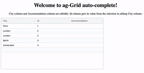
{ id: 1, city: "Paris", country: "France" },
{ id: 2, city: "London", country: "United Kingdom" },
{ id: 3, city: "Berlin", country: "Germany" },
{ id: 4, city: "Madrid", country: "Spain" },
{ id: 5, city: "Rome", country: "Italy" },
{ id: 6, city: "Copenhagen", country: "Denmark" },
{ id: 7, city: "Brussels", country: "Belgium" },
{ id: 8, city: "Amsterdam", country: "The Netherlands" },
],
columnDefs: [
{ headerName: "City", field: "city" },
{ headerName: "Country", field: "country" },
],
},
valueFormatter: (params) => {
if (params.value) return params.value.city;
return "";
},
},
{ headerName: "Price", field: "price" },
];
this.rowData = [
{ make: "Toyota", model: "Celica", price: 35000, madein: "London" },
{ make: "Ford", model: "Mondeo", price: 32000, madein: "Berlin" },
{ make: "Porsche", model: "Boxter", price: 72000, madein: "Amsterdam" },
];
this.components = { autoComplete: getAutoComplete() };
},
methods: {},
};
</script>Autocomplete cellEditor for ag-Grid, made as Angular component. In addition to Angular, there are dependencies on Ag-Grid Angular and Angular's HttpClient. The component uses ag-theme-balham.
I was looking for an autocomplete cellEditor but could not find any. I decided to write a component that would use ag-Grid for the presentation of the selection box. I had the following requirements:
- Use keyboard input only, for start/end editing and selection.
- Be able to use mouse input.
- Start editing by typing.
- Autocomplete basis an existing array of values, or basis an API.
- Autocomplete basis text input, but actual selection being an object.
For the last requirement, the stackblitz example will show an example of both returning an object and returning just a value.
This cellEditor can be used as an autocomplete text cell editor in for ag-Grid Angular. In the app component, the column definitions need to include the necessary configuration details under cellEditorParams:
rowDataof the presented options, in ag-Grid compliant format.apiEndpointis the url of the API endpoint (use this instead ofrowData).columnDefsof the presented options, in ag-Grid compliant format.propertyRenderedthe field that is shown in the renderer, and thus used for the text autocomplete.returnObjectboolean flag to return either the undelying object of the row, or the text value of the cell. If enabled, the grid needs to be configured to show one value within the object. Below has an example that usesvalueFormatter.
  { headerName: 'City', field: 'cityObject', editable: true,
        cellEditor: 'autoComplete',
        cellEditorParams: {
          'propertyRendered': 'city',
          'returnObject' : true,
          'rowData': [
            { 'id': 1, 'city': 'Paris', 'country': 'France' },
            { 'id': 2, 'city': 'London', 'country': 'United Kingdom' },
            { 'id': 3, 'city': 'Berlin', 'country': 'Germany' },
            { 'id': 4, 'city': 'Madrid', 'country': 'Spain' },
            { 'id': 5, 'city': 'Rome', 'country': 'Italy' },
            { 'id': 6, 'city': 'Copenhagen', 'country': 'Denmark' },
            { 'id': 7, 'city': 'Brussels', 'country': 'Belgium' },
            { 'id': 8, 'city': 'Amsterdam', 'country': 'The Netherlands' }],
          'columnDefs': [
              {headerName: 'City', field: 'city' },
              {headerName: 'Country', field: 'country' }]
        },
	valueFormatter: (params) => {
		if (params.value) return params.value.city;
		return "";
	},
    },
When an API is called, rowData can be left out and instead an API endpoint needs to be specified. For example:
'apiEndpoint': '/api/cities/'The component will use HttpClient to call the API and will query with the first 2 characters of the input field, with the propertyRendered as the query key. For example its query would be: /api/cities/?city=Pa when the input field shows "Paris". Even though the API query would only be basis "Pa" the grid is further filtered in the component to match "Paris".
Demonstration on https://stackblitz.com/edit/ag-grid-auto-complete