Responsive popup window sizing with Bootstrap 5. Modal width, modal height, fullscreen modal, large modal with lg & xl modal classes and more.
Check out Modal Size Documentation for detailed instructions & even more examples.
Modals have three optional sizes, available via modifier classes to be placed on a .modal-dialog. These sizes kick in at certain breakpoints to avoid horizontal scrollbars on narrower viewports.
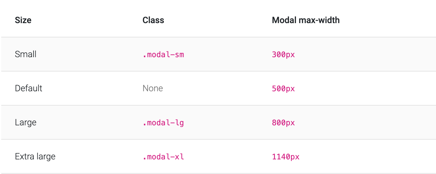
<div class="modal-dialog modal-xl">...</div>
<div class="modal-dialog modal-lg">...</div>
<div class="modal-dialog modal-sm">...</div>Another override is the option to pop up a modal that covers the user viewport, available via modifier classes that are placed on a .modal-dialog.
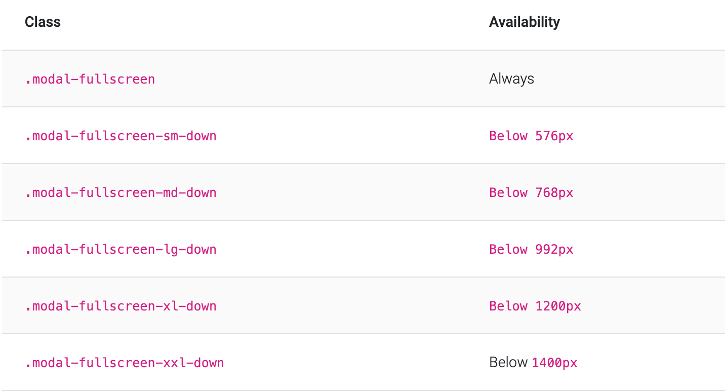
<!-- Full screen modal -->
<div class="modal-dialog modal-fullscreen-sm-down">...</div>-
Download MDB 5 - free UI KIT
-
Choose your favourite customized component and click on the image
-
Copy & paste the code into your MDB project
- Bootstrap Address Form
- Bootstrap Avatar
- Bootstrap Back To Top Button
- Bootstrap Carousel Slider with Thumbnails
- Bootstrap Chat
- Bootstrap Code Blocks
- Bootstrap Comments
- Bootstrap Comparison Table
- Bootstrap Credit Card Form
- Bootstrap Drawer
- Bootstrap Nested Dropdown
- Bootstrap FAQ component / section
- Bootstrap Gallery
- Bootstrap Hamburger Menu
- Bootstrap Invoice
- Bootstrap Jumbotron
- Bootstrap Login Form
- Bootstrap Maps
- Bootstrap Media Object
- Bootstrap Mega Menu
- Bootstrap Multiselect
- Bootstrap News Feed
- Bootstrap Offcanvas
- Bootstrap Order Details
- Bootstrap Page Transitions
- Bootstrap Payment Forms
- Bootstrap Product Cards
- Bootstrap Profiles
- Bootstrap Quotes
- Bootstrap Registration Form
- Bootstrap Expanding Search Bar
- Bootstrap Shopping Carts
- Bootstrap Side Navbar
- Bootstrap Sidebar
- Bootstrap Social Media Icons & Buttons
- Bootstrap Square Buttons
- Bootstrap Survey Form
- Bootstrap Testimonial Slider
- Bootstrap Testimonials
- Bootstrap Textarea
- Bootstrap Timeline
- Bootstrap To Do List
- Bootstrap Video Carousel / Gallery
- Bootstrap Weather
- Bootstrap Dark Mode
- Bootstrap Padding
- Bootstrap Modal Methods
- Bootstrap Modal Backdrop
- Bootstrap Card Deck
- Bootstrap Table Filter
- Bootstrap Slider
- Bootstrap Logo
- Bootstrap Popup
- Bootstrap Max Width
- Bootstrap Hero
- Bootstrap Select Dropdown
- Bootstrap Labels
- Bootstrap Dialog
- Bootstrap Screen Sizes
- Bootstrap Dropdown Button
- Bootstrap Widgets