react-ityped is a react component that wraps https://www.npmjs.com/package/ityped package
by using npm:
$ npm i react-ityped by using yarn:
$ yarn add react-ityped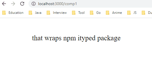
Original ityped package already has support for React applications. But it uses DOM directly with html-id.
This situation might be appropriate for react applications that doesn't use Reach Hook API. But if you're using react v16.8 or higher, you should use useRef hook instead of direct DOM access.
What do I mean?
This example has taken from ityped package.
If you want to check. link
import React, { Component } from 'react'
import { init } from 'ityped'

export default class Hello extends Component {
    componentDidMount() {
        const myElement = document.querySelector('#myElement')
        init(myElement, { showCursor: false, strings: ['Use with React.js!', 'Yeah!'] })
    }
    render() {
        return <div id="myElement"></div>
    }
}
With useRef() hook, we don't require to specify any id on our component. useRef() hook does it for us.
In this regards react-ityped uses useRef() hook to access native DOM element.
import React from 'react';
import ITyped from 'react-ityped';
import './index.css';

const Example = () => {

    const strings = ['react-ityped', 'is a', 'react component', 'that wraps npm ityped package.']

    return (
        <ITyped className='container ityped-cursor'
            showCursor={false}
            strings={strings}
            typeSpeed={50}
            backSpeed={50}
            startDelay={100}
            backDelay={250}
        />
    );
}

export default Example;
If you want to check more detail about styling, check that link
// index.
.ityped-cursor {
    font-size: 2.2rem;
    opacity: 1;
    -webkit-animation: blink 0.3s infinite;
    -moz-animation: blink 0.3s infinite;
    animation: blink 0.3s infinite;
    animation-direction: alternate;
}

@keyframes blink {
    100% {
        opacity: 0;
    }
}

@-webkit-keyframes blink {
    100% {
        opacity: 0;
    }
}

@-moz-keyframes blink {
    100% {
        opacity: 0;
    }
}

.container {
    text-align: left;
    font-size: 25px;
    align-self: center;
    margin-left: 3%;
    margin-top: 3%;
}Common props you may want to specify include:
| Name | Type | Discription | Default |
|---|---|---|---|
| strings | string[] | An array with the strings that will be animated | ['Put your strings here...', 'and Enjoy!'] |
| cursorChar | string | Character for cursor | `" |
| typeSpeed | number | Type speed in milliseconds | 100 |
| backSpeed | number | Type back speed in milliseconds | 50 |
| startDelay | number | Time before typing starts | 50 |
| backDelay | number | Time before backspacing | 500 |
| loop | boolean | The animation loop | false |
| showCursor | boolean | Show the cursor element | true |
| disableBackTyping | boolean | Disable back typing for the last string sentence | false |
See the props documentation for complete documentation on the props that react-ityped supports.
MIT © Enes Usta