Work in progress and pending to properly document.
A Custom ViewPager Library for Android.
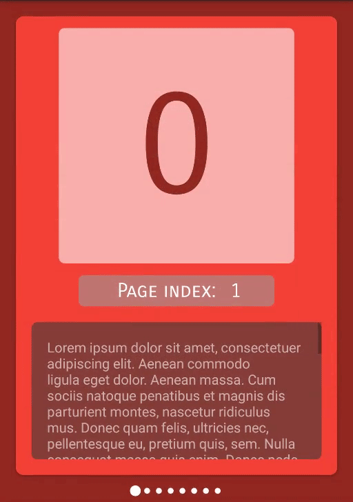
- Infinite Pages (from first to last and vice versa)
- Page Indicators
- Single Page Supported
- Step 1. Add the JitPack repository to your build file. Add it in your root
build.gradleat the end of repositories:
  allprojects {
    repositories {
      ...
      maven { url 'https://jitpack.io' }
    }
  }
- Step 2. Add the dependency
  dependencies {
            implementation 'com.github.EndikaAguilera:InfiniteViewPager:v1.0-beta.3'
  }
- Step 1. Add the JitPack repository to your build file.
  dependencies {
            implementation 'com.github.EndikaAguilera:InfiniteViewPager:v1.0-beta.3'
  }
- Step 2. Add the dependency
	<dependency>
	    <groupId>com.github.EndikaAguilera</groupId>
	    <artifactId>InfiniteViewPager</artifactId>
	    <version>v1.0-beta.1</version>
	</dependency>
-
Replace
ViewPagertoCustomViewPagerPagerAdaptertoCustomPagerAdapter
-
Optional
Fragmentmust extendCustomFragmentwhen using callbacks for (first and last helper pages)
<com.customviewpager.viewpager.CustomViewPager
    android:id="@+id/container"
    android:layout_width="0dp"
    android:layout_height="0dp"
    android:overScrollMode="never"
    app:layout_behavior="@string/appbar_scrolling_view_behavior"
    app:layout_constraintBottom_toBottomOf="parent"
    app:layout_constraintEnd_toEndOf="parent"
    app:layout_constraintStart_toStartOf="parent"
app:layout_constraintTop_toTopOf="parent" />private void initCustomViewPager() {
// SectionsPagerAdapter that returns a fragment corresponding to one of the pages
SectionsPagerAdapter adapter = new SectionsPagerAdapter(getSupportFragmentManager(), YOUR_DATA);
// Set up the ViewPager with the sections adapter.
CustomViewPager viewPager = findViewById(R.id.YOUR_CUSTOM_VIEW_PAGER_ID);
viewPager.setAdapter(adapter);
// Set up the ViewPager Indicators. Note that requires a ConstraintLayout as parent.
ConstraintLayout parentContainer = findViewById(R.id.YOUR_PARENT_CONSTRAINT_LAYOUT);
viewPager.initViewPagerIndicators(context, parentContainer);
final int maxIndicatorRows = 2;
viewPager.setIndicatorsMode(POSITION_INCLUDE_BOTTOM, MODE_CLAMPED_HEIGHT, maxIndicatorRows); // optional
// setCurrentItem() should be called after set the indicators (if using them),
// or the initial selection wont match the real selected page
viewPager.setCurrentItem(0);
}- Page Selection.
- AutoScroll to selected item when needed.
- Customization.
- Size.
- Position. (x4)
- Height Adjust Modes. (x3)
- Max items per row.
- Colors and/or Drawable.
    - POSITION_FLOAT_TOP        // both view's shares top postion, so indicators are 'inside' the CustomViewPager
    - POSITION_FLOAT_BOTTOM     // both view's shares bottom postion, so indicators are 'inside' the CustomViewPager
    - POSITION_INCLUDE_TOP      // CustomViewPager's top position will be connected to indicators bottom position
- POSITION_INCLUDE_BOTTOM // CustomViewPager's bottom position will be connected to indicators top position - MODE_WRAP_HEIGHT // from 1 to infinite based on rows count
- MODE_FIXED_HEIGHT // itemHeight * (margin * 2) * maxVisibleIndicatorRows
- MODE_CLAMPED_HEIGHT // from 1 to maxVisibleIndicatorRowsYou can override any of the following resouces as desired.
    <color name="indicatorNormal">YOUR_COLOR</color>
    <color name="indicatorPressed">YOUR_COLOR</color>
<color name="indicatorSelected">YOUR_COLOR</color> <dimen name="indicator_vertical_padding">YOUR_VALUE</dimen>
<dimen name="indicator_horizontal_margin">YOUR_VALUE</dimen>
<dimen name="indicator_item_size">YOUR_VALUE</dimen>
<dimen name="indicator_item_padding">YOUR_VALUE</dimen> ic_indicator.xml