https://deco3500.github.io/teamdeathmatch/promosite/index.html
Team Deathmatch has created a prototype for the Bulletin project using the web tool Marvel. Marvel allowed us to create mockups of the site and connect them with touch hot spots to provide a realistic experience. This was a simple way to simulate the user’s journey and actions they take when using the app. Marvel also allowed us to easily open the prototype on our phones for user testing. When we received user testing feedback and planned changes, we could easily change the mockups and replace the old ones to improve the prototype.
Prototype Link: https://marvelapp.com/ig1446
Bulletin has been designed as a mobile application, so to get the proper experience we would prefer you to use our prototype on your phone. Whilst opening and using the Marvel app prototype on a desktop will allow you to see all the screens we have designed, it will mean that none of the swipe interactions and gestures that have been implemented will not be usable, and you will have to instead revert to clicking on the hotspots. Please note: the prototype has been designed to fit older iPhones, and as such may cause some screens to exceed the height of your phone, meaning you may have to scroll up and down a little to see the full screen.
From an internet browser on your phone, open the link provided above. You will be taken to our prototype landing page. You will be shown the screen captured below if on iOS, or a slightly different version if on Anroid or Windows Phone.
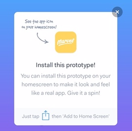
Following the instructions prompted will allow you to install the prototype on your phone so you can experience it without the menu and address bars that a mobile browser will have. You can view the prototype from the browser directly, but because of the screen sizes you will have to scroll up and down to view the entire screen which is not the way we want to present the prototype.
If you want the full experience of the prototype, firstly open and play around with the prototype on your phone, experience it with the context and reactions we designed it for and then open it on a desktop or laptop browsers and go through seeing each screen in its full appearance.
Despite a huge influx of mobile users reading news daily on their phones, often during their daily commute on public transport, people are still required to scroll through news websites and apps to find what they want to read. Opening up news stories one by one is a time consuming and annoying process when you’re trying to find something interesting to read. Some users are inconvenienced by the nature of the design on these sites, for example, sports news it typically featured only at the very bottom of the news app’s front page. Though such readily available mobile news has been a great push in the right direction, these apps are as impersonal as a newspaper. They display what they think you’ll want to read, but really you probably tend to read the same sections and look for the same types of articles as you normally do. On top of this standard mobile news services offer little social functionality outside of sharing a to social media feeds.
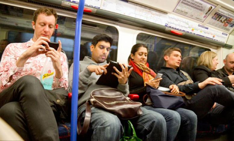
With smartphones becoming nearly ubiquitous within our society, news is being increasingly targeted towards mobile users both in the form of responsive websites and mobile applications. Delivering your personalised news right to your phone will enable you to access the content you want when you want it. Bulletin utilises all the features of a mobile application, including push notifications, easy sharing options, and opportunities to connect with your friends and contacts. Users can set up preferences for media outlets and category preferences will allow you to customise your experience even further. Having users connect with their friends and family opens up more opportunity for news curation. In cases where users cannot decide on prefered topics or sources they can instead elect to view stories that their friends, family or well-known/trending users have favorited. Having users connect and build their own curated lists of stories to be shared later promotes a healthy stream of interesting and important news circulating.
Bulletin went through multiple design iterations throughout the semester after received feedback from the tutors and our cohort in stand ups and feedback from user testing sessions.
A list of Bulletin iterations can be found here
Every week the group would employ multiple design tactics to try and figure out the problems with Bulletin and the right direction to take the project. At every stand up check point our ideas would be vetted by the tutors and we would receive useful feedback on where we could develop bulletin more and what social and mobile aspects needed improving or reworking.
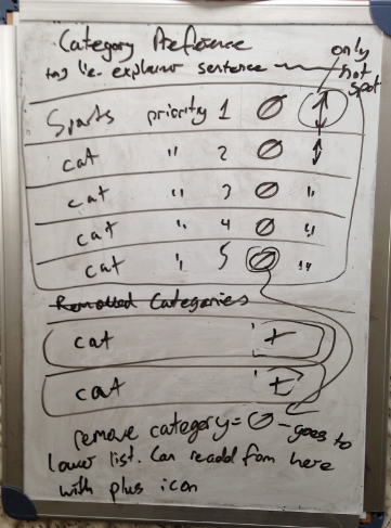
To help rapidly iterate over ideas and work through basic interface structures we used whiteboarding as a core technique. We used whiteboarding at the beginning of the semester when we were first planning out the idea and then later in the middle of the semester when we brain stormed user interface designs for Bulletin. Below are some pictures of whiteboards we drew up.

Another technique that we used consistently was our personas. These personas focused extensively on types of news consumers. Whenever we had ideas for iteration we would cross reference these ideas with the personas and see what sort of user type we are trying to serve.
Understand what sort of environment we were designing was important for our group. Without having a good idea of who the primary user was, what their reading patterns were or how they used technology would mean we couldn’t possibly design with their needs in mind. At the beginning of the semester we did a lot of research into the user and their needs, this research is presented in the wikis below.
American Press Institude Article
Knight Foundation Article
Pew Research Centre Article
User testing was an integral tool to figuring out if the iterations of our design were successful with possible users. User testing was the primary tool used towards the end of the semester when we started to refine the iterations of our design and focus on a single direction. Below are links to two user testing sessions that were conducted.
The first testing session that we conducted looked primarily at the visual design and usability of the prototype. The testees were asked to firstly complete scenarios that a typical user would attempt. After they had completed the scenarios they were asked questions about their experience.
From this session we received a lot of helpful feedback on the visual design and usability of the prototype. Testees feedback on the visual design led to many changes. One of the largest is the change from a dark color scheme to a much brighter color scheme. Testees also commented on how cluttered and confusing some pages were. We took this feedback and after discussing its validity amongst the group decided on design changes that would improve the user experience. We also received feedback on the way we worded the buttons and links in the prototype. We took this feedback and recreated our naming convention to be more consistent and reduce confusion on what buttons in the prototype do.
The full breakdown of all the results can be found in the dedicated wiki page here..
The second testing session focused on the social aspect of the prototype. The participants were given a set of questions tailored to help the team iterate the social feature of our app.
This testing session helped the group figure out the confusing parts of the application according to the users. The participants were asked what they thought of the app's feature of adding their friend's news board onto their playlist. A lot of them said that they like that aspect. However, a few of the participants were confused on how it worked when they first tried out the prototype. The team decided to add an instruction page when a user starts a playlist for the first time. We also received feedback to change around the design for the prototype in order to emphasise the social aspect of the concept. The group decided to re-word some of the words around the application in order for a lesser confusion.
The full breakdown of all the results can be found in the dedicated wiki page here..
| Team Member | Student Number | Responsibilities |
|---|---|---|
| Astrid Farmer | 43527193 | Re-working existing ideas throughout the semester, conducting market, demographic and technology research, supplementing user testing sessions, planning back-end implementation, creating promotional website for Bulletin |
| Daniel Fraser | 43595839 | Re-working existing ideas throughout the semester, developing initial low-fidelity wireframes, designing high-fidelity mockups to be used in the prototype, creating the prototype on Marvel |
| Giselle Pastulero | 43527652 | Re-working existing ideas throughout the semester, conducting user and demographic research, running all user testing sessions, designing logo, compiling user testing results |
| Phillip Townsend | 43538425 | Re-working existing ideas throughout the semester, interacting with and pitching to potential users, compiling prototype videos, planning back-end implementation |