Home
Welcome to the CUTIE tutorial and wiki, which will provide software, documentation, and tutorials for this statistical resampling method developed by the Clemente Lab. CUTIE is implemented in Python.
If you use CUTIE in your work, please cite the paper:
Bu, K., Wallach, D. S., Wilson, Z., Shen, N., Segal, L. N., Bagiella, E., & Clemente, J. C. (2022). Identifying correlations driven by influential observations in large datasets. Briefings in Bioinformatics, 23(1). doi:10.1093/bib/bbab482
CUTIE computes all pairwise correlations in a given dataset and determines which of those initially significant correlations are potentially driven by outliers, and can additionally rescue correlations deemed initially significant due to these influential points.
CUTIE is available as a Python package. Any questions or concerns can be sent to kbu314@gmail.com.
Table of contents
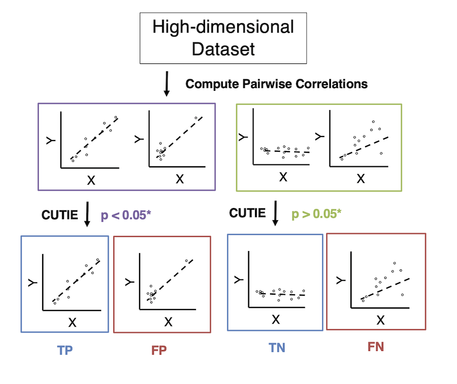
The following figure shows CUTIE's workflow.
CUTIE is written for python 3.7 and requires the following packages
- click
- numpy
- pandas
- statsmodels
- scipy
- matplotlib
- seaborn
- py
- pytest
- Clone this repository
https://github.com/clemente-lab/CUTIE.gitinto a desired <install_path> - Install Anaconda3:
https://www.anaconda.com/distribution/ - Create a conda environment for CUTIE:
conda create -n 'cutie' python=3.7 click numpy pandas statsmodels scipy matplotlib seaborn py pytest - Activate the conda environment:
conda activate cutie - Install dependencies:
conda install -c anaconda click numpy pandas statsmodels scipy matplotlib seaborn py pytest - In CUTIE's install directory, run:
python3 setup.py install
The config file test_config.ini will need to be modified depending on the location of the input data files and the desired result for the output directory. In any given config file we have the given fields (see CUTIE/demos/config_template.ini). Note that tidy dataframes have samples as rows, variables as columns; untidy denotes the converse. When you are ready, simply run calculate_cutie.py -i <path_to_config_file>.
[input]
samp_var1_fp: <path_to_df/df.csv>
delimiter1: <delimiter type e.g. ,>
samp_var2_fp: <path_to_df/df.txt>
delimiter2: <delimiter type e.g. \t>
f1type: <tidy or untidy>
f2type: <tidy or untidy>
skip1: <integer>
skip2: <integer>
startcol1: <integer>
endcol1: <integer>
startcol2: <integer>
endcol2: <integer>
paired: <True or False>
overwrite: <True or False>

[output]
working_dir: <your_path/>

[stats]
param: <p or r>
statistic: <pearson, rpearson, spearman, rspearman, kendall, rkendall>
resample_k: <integer, default 1>
alpha: <float, default 0.05>
mc: <nomc, fdr, fwer, or bonferroni>
fold: <True or False>
fold_value: <integer, default 1>
corr_compare: <True or False>

[graph]
graph_bound: <integer, default 30, upper limit of scatterplots to generate per correlation class>
fix_axis: <True or False>
In this tutorial, we will be using a dataset drawn from:
Segal, L.N., et al., Enrichment of the lung microbiome with oral taxa is associated with lung inflammation of a Th17 phenotype. Nat Microbiol, 2016. 1: p. 16031.
and use CUTIE to classify bacteria-metabolite correlations as TP or FP. The bacterial data was obtained from 16S sequencing of bronchoscopy samples, while the metabolome data was obtained from the bronchoalveolar lavage fluids. The bacterial data is stored as a tsv OTU-table in conventional untidy format (samples as columns, taxanomic identifiers as rows) while the metabolite data is stored in tidy format (samples as rows, variables as columns). Note that the first column (tidy data) or row (untidy data) are the sample names.
- Modify the config file
CUTIE/demos/tutorial_config.iniso that the fields under [input] matchsamp_var1_fp: <install_path>/CUTIE/demos/data/otu_table.tsvandsamp_var2_fp: <install_path>/CUTIE/demos/metabolite_table.tsv. Additionally, modify the working directory to<install_path>/CUTIE/demos/otu_metabolite_tutorial/. - Activate the conda environment
conda activate cutiefrom the setup above. - Run
calculate_cutie.py -i <install_path>/CUTIE/demos/tutorial_config.txt.This should take about a minute.
CUTIE's output includes a variety of diagnostic features aimed at elucidating sources of outllier bias behind pairwise correlations in a given dataset. From the tutorial above, you should see the following:
-
A log file, <timestamp_log.txt>, which indicates what CUTIE has parsed; information is included such as # of variables, samples, and their string identifiers.
-
A directory
data_processingwith dataframe txt files summarizing the results of CUTIE. -
A
graphsdirectory, containing a variety of exploratory visualizations.
We will now examine these results in greater detail.
First, we examine the log file, located directly at `<working_dir>/<log.txt>:
The first set of lines provides basic information about the input files:
Begin logging at 2020-07-28T11:32:10.976256
The original command was -i config.ini
The input_config_fp md5 was 72c25a25ceda371c8160b845e06b0c75
The length of variables for file 2 is 83
The number of samples for file 2 is 28
The md5 of samp_var2 was 0b3b01be6d64565ba589e63680cdea46
The length of variables for file 1 is 897
The number of samples for file 1 is 28
The md5 of samp_var1 was c1a93eeee6660b7228a5e2a32a5a4f7f
We see the timestamp of logging and the original config file name. The MD5 of the config as well as the dataframe files are shown to check for differences between files should files share the same name. Additionally, you can observe the number of samples and variables that were parsed.
The next set of lines delves into the contents of the parsing:
There are 28 samples
The first 3 samples are ['101019AB.N.1.RL', '110228CJ.N.1.RL', '110314CS.N.1.RL']
The first 3 var1 are ['k__Archaea;p__Crenarchaeota;c__Thaumarchaeota;o__Cenarchaeales;f__Cenarchaeaceae;g__', 'k__Archaea;p__Crenarchaeota;c__Thaumarchaeota;o__Cenarchaeales;f__Cenarchaeaceae;g__Nitrosopumilus', 'k__Archaea;p__Crenarchaeota;c__Thaumarchaeota;o__Cenarchaeales;f__SAGMA-X;g__']
The first 3 var2 are ['glutamic_acid', 'glycine', 'alanine']
Here we can see that 28 samples were obtained in the intersection of the two input dataframes (this number may be lower if sample identifiers do not match). The first 3 sample names and variable names for each dataframe are provided; here we can confirm that the first dataframe (var1) has bacteria, while the second dataframe (var2) has metabolite data.
The next set of lines provides basic descriptors of the statistics:
The parameter chosen was p
The statistic chosen was kendall
The type of mc correction used was nomc
The threshold value was 0.05
The length of initial_corr is 2113
The parameter chosen will be p or r depending on whether you wish to use p-value or r-value as a threshold criterion for deciding whether a correlation is a CUTIE (FP) or not; the statistic here was kendall (indicating TP/FP using kendall correlation coefficient; rkendall would indicate TN/FN separation). Here in this example, no multiple corrections adjustment was used, the alpha threshold was 0.05 (would be lower with Bonferroni, FDR, etc.), and 2113 were chosen for screening by CUTIE on the basis that p < 0.05 for this set using Kendall's Tau.
The next set of lines are specific to comparing CUTIE with other diagnostics (Cook's D, DFFITS, DSR) and indicate the number of pairwise correlations labeled as FP according to a particular set of metrics. Note that when comparing CUTIE to these metrics, the comparison is with CUTIE run using Pearson's correlation (as the other metrics also were designed around Pearson).
-
Lines formatted such as
The amount of unique elements in set [<metrics>] is nwhere metrics comprises a subset of CUTIE, Cook's D, DFFITS, and DSR indicate that when looking at exactly that set of metrics,ncorrelations are tagged as FP's. Note that this does not mean CUTIE foundnFP's, but rather thatncorrelations were tagged only by CUTIE as FP (and not by other metrics). -
Lines formatted such as
The number of false correlations according to cutie_1pc is 1971are more straightforward, indicating that if you were to use CUTIE, you would identify 1971 correlations overall as FP (some of which would be also identified as FP using other methods, some unique to CUTIE).
The next set of lines are specific to CUTIE only and pertain to the statistic chosen:
The number of false correlations for 1 is 1541
The number of true correlations for 1 is 572
The number of reversed correlations for TP/FN1 is 0
The number of reversed correlations for FP/TN1 is 0
Here, 1541 correlations were tagged as FP out of 2113, while 572 were labeled TP. The number of reverse sign correlations are 0 among both the 'true' correlations (TP) and 'false' correlations (FP). If the statistic were rkendall (i.e. running CUTIE for TN/FN separation), the 'true' correlations would be FN and the 'false' correlations would be TN. The '1' indicates that k = 1 points were removed; additional lines would be present (e.g. TP/FN2, ...) if more points were removed.
Looking in data_processing, we find 4 txt files: (1) counter_samp_number_resample1.txt, indicating the number of CUTIE's
(FP) to which each sample contributes, (2, 3) counter_var1_number_resample1.txt and counter_var1_number_resample2.txt, the analogous files for dataframe1 (otu) and dataframe2 (metabolite), and finally (4) summary_df_resample_1.txt, which
contains more detailed information regarding each pairwise correlation. Examining the file for this example, we have
the following headers:

- Each row in the dataframe represents a pairwise correlation.
-
var1_indexandvar2_indexdenote the indicies (0-indexed) of the variables for a given pairwise correlation. -
pvalues,correlations, andr2valsdenote the original p-value, r-value, and r-squared for that correlation - indiciators is 0 if that correlation was never assessed (p > 0.05), 1 if it is a TP, and -1 if it is an FP according to CUTIE
-
TP_rev_indicatorsandFP_rev_indicatorsare 1 if the correlation was a reverse-sign correlation of the TP or FP class respectively, 0 if not -
extreme_pandextreme_rdenote the most extreme p and r-value obtained respectively when omitting a point (highest p-value if performing TP/FP classification, lowest p-value obtained if performing TN/FN classification) -
p_ratioandr2_ratiorepresent the ratio between the most extreme p and r-squared value and the original value. - The bracket/list values represent areas on a venn-diagram and only appear because corr_compare was set to True in the original config. Here, a value can be 0, 1 or -1 for a given correlation; 0 denotes that correlation was never assessed (never significant), -1 if that correlation is a FP as considered by the metrics in that region (e.g. a -1 under
['cookd','dffits','dsr']would indicate that correlation was a false positive to those three metrics, but not CUTIE) and 1 otherwise.
The graphs directory contains a variety of exploratory visualizations:
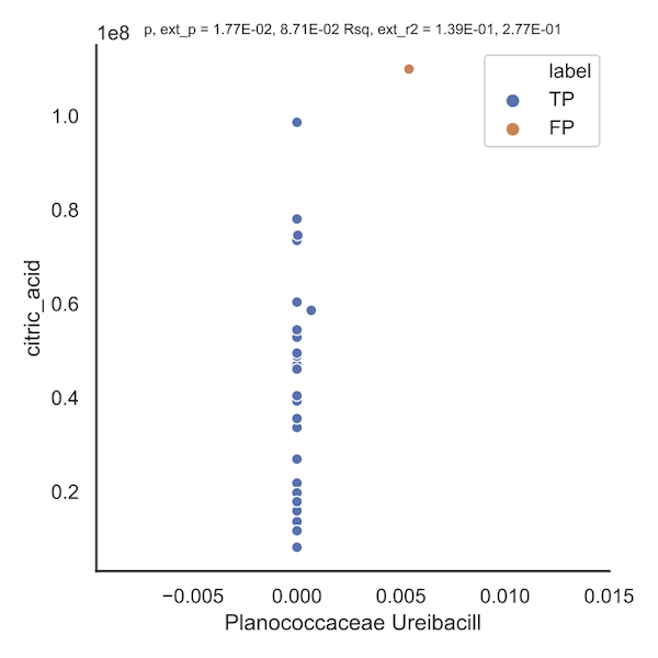
-
false_corr_FP_1_1541indicates that when removing k = 1 points, 1541 correlations were flagged as false positives. An eample is shown below; the orange point(s) indicate that removal of that point induces a loss in significance. The title of the plot includes information such as the original p value (1.77e-02), the worst p-value obtained upon removal of a point (8.71e-02), and similarly for r-squared.
-
true_corr_rev_<class>_<k>_<n>_revsignsuch astrue_corr_rev_TP_1_0_revsignand similarly named folders contain randomly sampled scatterplots from correlations classified as True Positives and exhibit a sign-reversal; k indicates # of points being resampled (here k = 1) and n denotes the number of scatterplots in this class (here n = 0). Though none exist in this dataset, we show an example from the World Health Organization health statistics dataset (see Reshef, D.N., et al., Detecting novel associations in large data sets. Science, 2011. 334(6062): p. 1518-24). Here, the point in orange, when removed, causes the correlation to remain a TP but changes the sign of association.

-
folders such as
<metrics>_<class>_<k>_<n>such as['cutie_1pc', 'dsr']_TP_1_165and['cutie_1pc', 'dsr']_FP_1_0indicate the number of correlations belonging to that class according to such metrics (e.g. 165 correlations were flagged as TP by CUTIE and DSR but not by any other metric. -
plots such as
sample_corr_<metrics>_<class>_<k>.pdfe.g.sample_corr_['cutie_1pc', 'cookd', 'dffits', 'dsr']_FP_1.pdfindicate the distribution of sample correlation coefficients in set of FP correlations as flagged by all four metrics combined. Here we illustrate the distribution of sample kendall correlations in the FP (top) and TP (bottom) set of correlations; one can appreciate that FP's tend to be weaker in correlation strength than TP's.


- plots such as
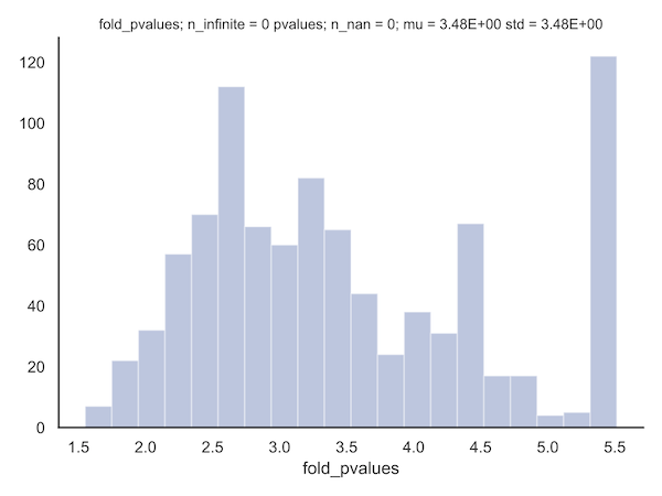
<class>_<k>_pvalues.pdf,<class>_<k>_log_fold_values, or<class>_<k>_log_pvaluesindicate the distribution of those parameters in a given class with k points resampled. The fold-change in p-values (here shown for the FP correlations) can be useful for determining the value for a particular fold-value constraint (see paper methods) to be applied.
- the set of three plots,
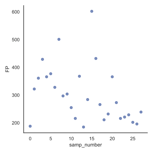
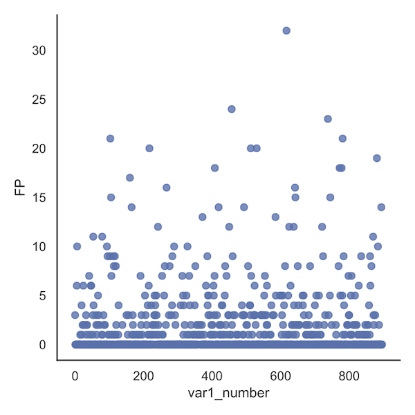
counter_samp_number_resample1.pdf,counter_var1_number_resample1.pdfandcounter_var2_number_resample1.pdfall plot the distribution from the datafarmes in data_processing, i.e. the number of CUTIEs (FPs) to which each sample or variable contributes. These diagnostic plots can be useful for determining if a particular sample might be miscalibrated or a particular variable is contributing to a disproportionate number of outliers.
Examining the sample file first, we see that sample 15 contributes to 602 FP's, more than any other sample. The particular
sample ID can be obtained from the corresponding dataframe, /data_processing/counter_samp_number_resample1.txt.
Looking at the analogous plot set of bacteria variables, we see that variable 617 in the OTU table (var1) contributes to 32 FPs.
While these numbers can only be visually approximated in the plots, the exact values can be obtained from the corresponding dataframe, i.e. /data_processing/counter_var1_number_resample1.txt
For the metabolite plot (below), no variable seems to stand out; sometimes this will be the case.

- Generation of paper figures in Python and R can be found in the cutie-analysis repo.
- CUTIE source code repository