


Live Demo ↗ | Documentation ↗ | Installation ↗
<smart-card> is a Custom HTML Element providing Card view with HTML Content](https://htmlelements.com/).
   <smart-card class="basic-card">
        <div class="card-content">
            <span class="card-title">Card Title</span>
            <p>
                I am a very simple card. I am good at containing small bits of information.
                I am convenient because I require little markup to use effectively.
            </p>
        </div>
        <div class="card-action">
            <a href="#">This is a link</a>
            <a href="#">This is a link</a>
        </div>
    </smart-card>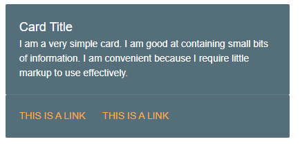
Smart HTML Elements components documentation includes getting started, customization and api documentation topics.
-
source/Javascript files.
-
source/styles/Component CSS Files.
-
demos/Demo files
-
Fork the
Smart-HTML-Elements-Corerepository and clone it locally. -
Make sure you have npm installed.
-
When in the
Smart-HTML-Elements-Coredirectory, runnpm installand thenbower installto install dependencies. -
Run a localhost or upload the demo on a web server. Then run:
- /demos/smart-card/smart-card-overview.htm
We are using ESLint for linting JavaScript code.
- Make sure your code is compliant with ESLint
- Submit a pull request with detailed title and description
- Wait for response from one of our team members
Apache License 2.0