TStyledButton
TStyledGraphicButton, TStyledButton are designed to expand Button UI styles to break the limits of classic TButton, TBitBtn and TSpeedButton provided in Delphi.
| Component | Description |
|---|---|
 |
TStyledGraphicButton is a "pure" Graphic Button with Styles (eg. Classic, Bootstrap, Angular, Basic-Color, SVG-Color) with support of ImageList, Action and full configuration of five states: Normal, Pressed, Selected, Hot and Disabled. You can use it also into a TVirtualList component. |
 |
TStyledButton is classic "button control" with Styles (eg. Classic, Bootstrap, Angular, Basic-Color, SVG-Color) with support of ImageList, Action and full configuration of five states: Normal, Pressed, Selected, Hot and Disabled, plus Focus and TabStop support. You can easily replace all of your TButton components. |
 |
TStyledSpeedButton derives from TStyledGraphicButton, and introduce Layout, Margin and Spacing properties, to control Drawing (Icon and Caption) as a standard TSpeedButton. You can also use Glyph and NumGlyphs. |
 |
TStyledBitBtn derives from TStyledButton, and introduce Layout, Margin and Spacing properties, to control Drawing (Icon and Caption) as a standard TBitBtn. You can also use Glyph and NumGlyphs. |
The Button Styles defined are not affected by VCLStyles and are also visibile on a "non styled" Windows application, so you can have more than a single Button styled also using VCLStyles. You can build rectangular or rounded or ellipsis/circle button as you prefer.
using only three elements you can setup your Button in a very simple way:
- StyleFamily: the main attribute for Styled Button
- StyleClass: a collection of predefined button style
- Style Appearance: eg.Normal or Outline
To simplify use of the Styled Buttons, there is a useful "Component Editor" to select three values that defines Button Style:
List of available StyleFamily
- Classic: a collection of Styles similar to VCLStyled TButton
- Bootstrap: a collection of Styles similar to Bootstrap buttons
- Angular-Light: a collection of styles similar to Angular buttons
- Angular-Dark: a collection of styles similar to Angular buttons
- Basic-Color: a collection of styles based to Delphi "normal" and "System" Color collection
- SVG-Color: a collection of styles based to Delphi "AlphaColors" Color collection
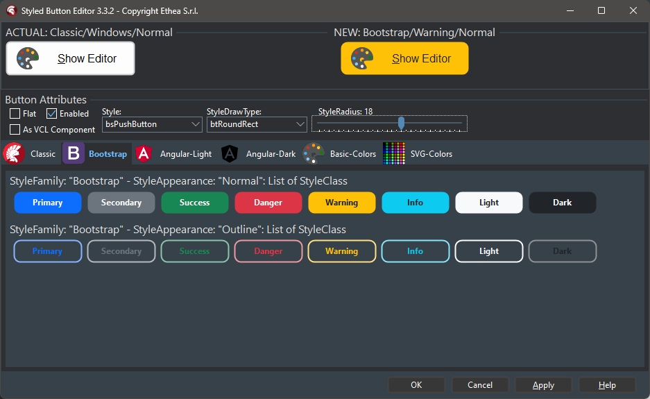
In this picture the Component Editor to select "Boostrap" styles: Style Appearance are Normal and Outline
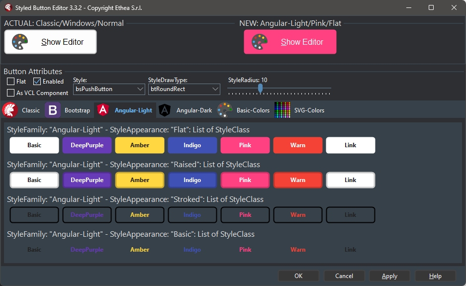
In this picture, the Component Editor to select "AngularUI" styles: Style Appearance are Flat, Raised, Basic, Stroked
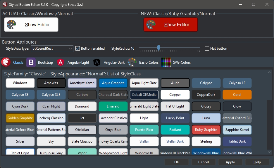
In this picture, the Component Editor to select "Classic" styles: Style Appearance are Normal and Outline
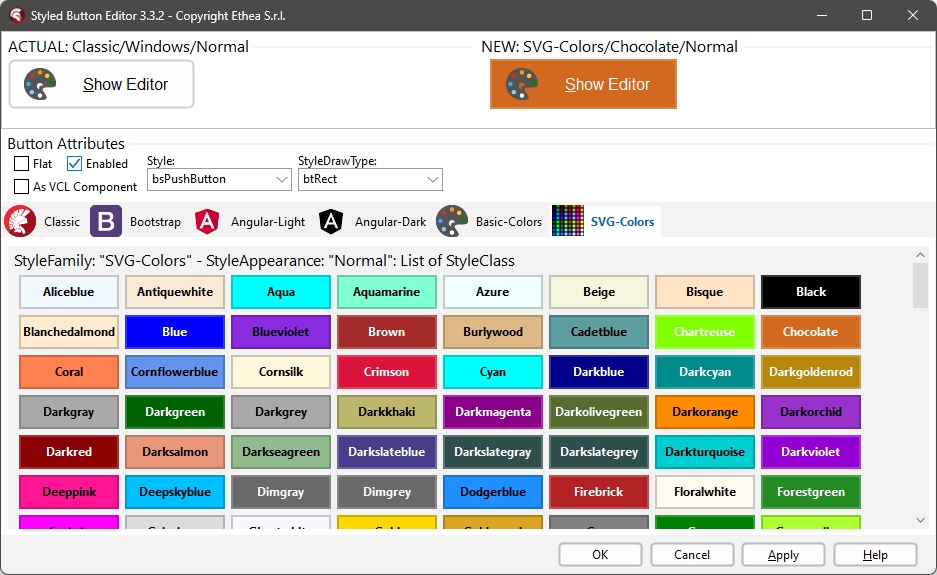
In this picture, the Component Editor to select "SVG-Color" styles: Style Appearance are Normal and Outline
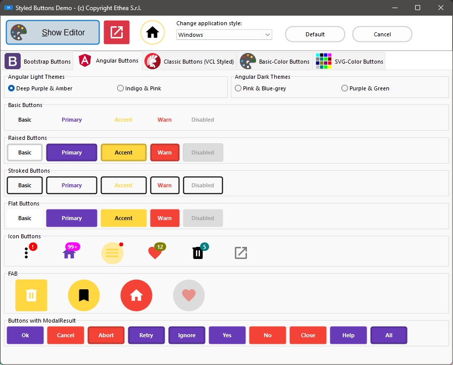
Demos\Delphi10_3+\StyledButtonsDemo
A simple demo to show the use of Buttons in many different ways...
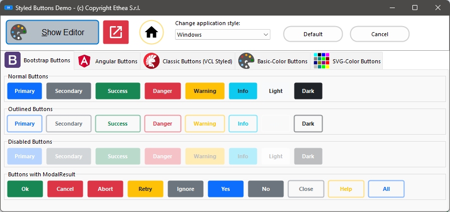
In the demo you can test many different ways to obtain Styled Button, Icon, FAB...
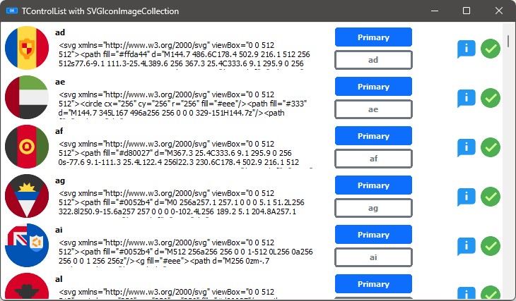
Demos\Delphi10_4+\StyledButtonInControlList
A simple demo to show how to use StyledGraphicButton into a ControlList (only for D10.4+)
Return to Home...