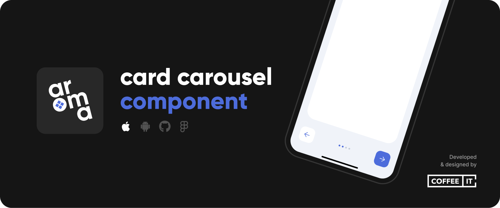
The CITCardsCarousel package provides a configurable arrangement of swipe-able card views which can be used for tutorials and other flows. Includes page indicators, skip, previous, next and finish buttons.
To install the Swift Package, go to Project > Package Dependencies > + > Search or Enter Package URL > Fill in:
https://github.com/Coffee-IT-Development/CardsCarousel-iOS-Component
Import CITCardsCarousel and add a CITCardsCarouselView to your SwiftUI view. The following example showcases how you could use the cards carousel in a sheet or fullScreenCover.
import CITCardsCarousel
import SwiftUI

struct CITCardsCarouselExampleView: View {
    @State private var selectedTab = 0
    @State private var isShowingInSheet = false
    @State private var isShowingFullscreen = false

    var body: some View {
        VStack {
            exampleButton("Show cards carousel fullscreen", action: showCardsCarouselFullscreen)
            exampleButton("Show cards carousel in sheet", action: showCardsCarouselInSheet)
        }
        .fullScreenCover(isPresented: $isShowingFullscreen) {
            cardsCarousel
        }
        .sheet(isPresented: $isShowingInSheet) {
            cardsCarousel
        }
    }

    var cardsCarousel: some View {
        CITCardsCarouselView(selection: $selectedTab, pageCount: 6, config: .coloredExample) {
            card("A").tag(0)
            card("B").tag(1)
            card("C").tag(2)
            card("D").tag(3)
            card("E").tag(4)
            card("F").tag(5)
        }
    }

    private func card(_ name: String) -> some View {
        ZStack {
            Color.white
            Text(name)
        }
    }

    private func exampleButton(_ text: String, action: @escaping () -> Void) -> some View {
        Button(action: action) {
            Text(text)
                .padding()
                .foregroundColor(.carouselButtonTextColor)
                .background(Color.coffeeItColor)
                .cornerRadius(20)
        }
    }

    private func showCardsCarouselFullscreen() {
        selectedTab = 0
        isShowingFullscreen = true
    }

    private func showCardsCarouselInSheet() {
        selectedTab = 0
        isShowingInSheet = true
    }
}/// The padding around the card container. Defaults to `.init(top: 24, leading: 24, bottom: 32, trailing: 24)`.
public var cardPadding: EdgeInsets
/// The safe area edges that a card ignores. Can be set to `.top` to allow a card to affect status bar area (i.e. let an image or color reach the top of the screen). Defaults to `nil`.
public var cardIgnoreSafeAreaEdges: Edge.Set?
/// The padding around the bottom controls. Defaults to `.init(top: 0, leading: 24, bottom: 24, trailing: 24)`.
public var bottomControlsPadding: EdgeInsets
/// The spacing between the bottom controls. Defaults to `16`.
public var bottomControlsSpacing: CGFloat
/// The height of the navigation buttons. May be used to negate visual glitches if navigation button font size and icon size differ too much, if `nil`, defaults to intrinsic content size.
public var navigationButtonHeight: CGFloat?
/// The padding around the navigation button content. Defaults to `init(top: 16, leading: 16, bottom: 16, trailing: 16)`.
public var navigationButtonContentPadding: EdgeInsets
/// The squared size of navigation button icons, i.e. `xmark`, `arrow.left` and `arrow.right`. Defaults to `20`.
public var navigationButtonIconSize: CGFloat
/// The dismiss icon used in the navigation buttons. Defaults to `xmark`.
public var navigationButtonDismissIcon: Image
/// The previous icon used in the navigation buttons. Defaults to `arrow.left`.
public var navigationButtonPreviousIcon: Image
/// The next icon used in the navigation buttons. Defaults to `arrow.right`.
public var navigationButtonNextIcon: Image
/// The finish text used in the right navigation button on the last page. Defaults to `Let's start`.
public var navigationButtonFinishText: String
/// If `true`, shows navigation buttons at the bottom of the cards carousel. If `false`, hides the navigation buttons.
public var showNavigationButtons: Bool
/// If `true`, shows indicators at the bottom of the cards carousel. If `false`, hides the indicators.
public var showIndicators: Bool
/// If `true`, will allow the user to swipe the cards left and right, if `false`, prevents any swipe interaction.
public var cardsSwipingEnabled: Bool
/// The tint color of all carousel elements if not overidden. Including primary button background color, secondary button text color and indicator color.
public var tintColor: Color
/// The backgroundColor of the carousel view, i.e. the area arround the card.
public var backgroundColor: Color
/// The text color of content within the primary buttons, i.e. the right navigation button. Defaults to `.white`.
public var primaryButtonForegroundColor: Color
/// The background color of primary buttons, i.e. the right navigation button. Defaults to `tintColor`.
public var primaryButtonBackgroundColor: Color?
/// The text color of content within the secondary buttons, i.e. the left navigation button. If `nil`, defaults to `tintColor`.
public var secondaryButtonForegroundColor: Color?
/// The background color of primary buttons, i.e. the left navigation button. Defaults to `primaryButtonTextColor`, which defaults to `white`.
public var secondaryButtonBackgroundColor: Color?
/// The color of active indicators. If `nil`, defaults to `tintColor`.
public var activeIndicatorColor: Color?
/// The color of inactive indicators. If `nil`, defaults to `tintColor` with `0.5 opacity`.
public var inactiveIndicatorColor: Color?
/// The font used for all button texts, i.e. the skip and continue button below the center card.
public var buttonTextFont: Font
/// The corner radius of the card. Defaults to `24`.
public var cardCornerRadius: CGFloat
/// The corner radius of the buttons. Defaults to `16`.
public var buttonCornerRadius: CGFloat
/// The corner radius of the indicators. Defaults to `.infinity` to make them round.
public var indicatorCornerRadius: CGFloat
/// The spacing between indicators. Defaults to `6`.
public var indicatorSpacing: CGFloat
/// The size of each indicator, determines both width and height of circle. Defaults to `6`.
public var indicatorSize: CGFloat
/// The animation of the entire carousel. Defaults to `.default`, but replaced with `nil` during onAppear to prevent visual glitches in `nonSwipeableCards`.
public var carouselAnimation: Animation?Look at our other repositories on our GitHub account.
All notable changes to this project will be documented in the Changelog.
CITCardsCarousel adheres to Semantic Versioning.
For questions, ideas or help you can reach us by email at [email protected].
Distributed under the MIT License. See LICENSE for more information.


