-
Notifications
You must be signed in to change notification settings - Fork 5
Opinion - demo image is better logo than current logo #37
Comments
|
@mystrdat What bothers you with the current logo? I feel they both look fairly similar. A problem with the demo image is that it has details which would get blurry or crowded on a smaller size image. You said something about a "Reduced form", what do you mean by that? |
|
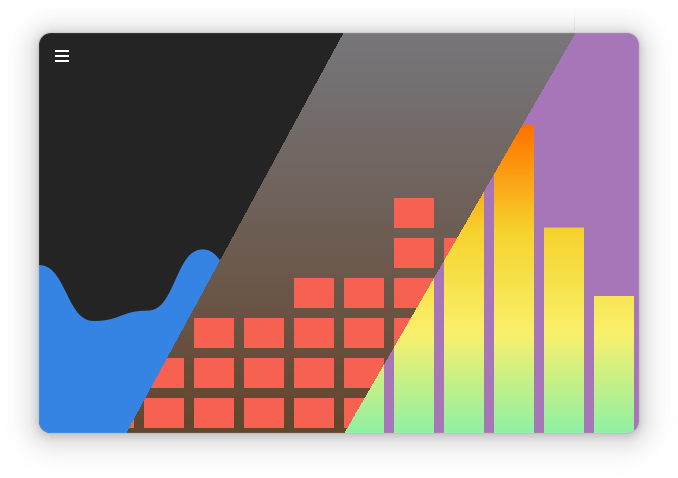
This image was created using the first version of Cavalier and only shows drawing modes that existed then, so it's not really expressive and therefore doesn't have any advantages over the current icon which represents default settings. |
|
I think the current logo 1) fails to make it clear that the app is a visualizer - the single bezier curve wave doesn't imply the typical peaks and valleys that would give you that idea 2) the orange on blue don't work together and lack contrast and 3) the note suggests its "plays" music instead. The idea in the original image does a better job with all of those and even further shows it has configurable variations - it doesn't need to show them all, just the fact that there's more than 1 gives you the right idea. Agreed that as it is, it would have to be reduced - probably just showing 2 configurations and simplifying their shapes/bars/rects, possibly also reducing the color range. I can give it a go unless you're completely opposed to it. What's the preferred format? SVG? |
I can't say I agree with the third argument, but the rest are good points, and anyway, as I said, I don't mind if somebody will create a new icon.
Feel free to create a new one. :) Yes, it should be in SVG format. It's also preffered if you would use App Icon Preview to create a new source image or reuse an existing one, this app will also help you make sure that the icon will look good in GNOME. Since you don't like having a note symbol in the icon, you would probably want to also change symbolic icon, but it's up to you. Also take not that there is currently work in progress on Circle variants for drawing modes, maybe you can use this somehow. Thanks in advance 😊 |
I would argue that the following image (with the menu removed) would make for a better logo of the app than the current one. If it feels too busy in smaller size, the same idea could be used in a reduced form

IMO it should be replaced
The text was updated successfully, but these errors were encountered: