Presets
A preset is a configuration of a component type with a set of properties or parameters. They are useful for defining common visual setup for components without having to define them over and over again in the components themselves.
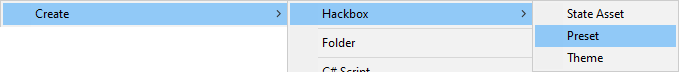
To create a preset asset, either go to Assets → Create → Hackbox → Preset, or right-click in the assets window, and go to Create → Hackbox → Preset, and then name the preset appropriately:
You can then edit the properties of the preset by selecting it in the assets and viewing the properties in the Inspector:

There are several different preset/component types to choose from, each exhibiting different visual behaviour. The types available are:
- Text, basic text display
- Text Input, text input
- Buzzer, simple buzzer button
- Button, button
- Choices, set of button options
- Range, number/slider input
Specify the type for the preset by editing it in the Inspector. More information about each type is available here.
There are many parameters you can adjust on a preset to give them a specific appearance and behaviour, such as color, background, text, event, value, etc.
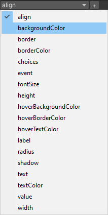
To add parameters to a preset in the Inspector:
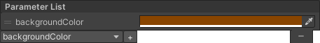
- Select the parameter to add in the dropdown then hit the + button to insert it into the parameter list box
- Edit the parameter properties that appear in the parameter list box
Go to the Parameters Reference page to learn more about each parameter and how it controls the appearance or behaviour of the preset/component.