


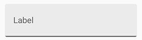
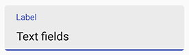
新的 Material Design 文本框,遵循 Google Material Design 规范。
- 修复
attr/counterTextColor命名冲突 (#97 #99 #105)。counterTextColor属性已更名为mCounterTextColor。
- 更新布局以支持更大的清除按钮与末图标 (#72)。
- 增加
setSimpleTextChangeWatcher()以便更好地监听文字输入 (#69)。 - 增加
app:manualValidateError属性以手动刷新错误状态 (#70)。 - Bug 修复 (#71)。
- Android 4.0.3 IceCreamSandwich (API lv 15) 或更高
- 你最喜欢的 IDE
在你的项目中加入以下依赖:
allprojects {
    repositories {
      ...
      maven { url 'https://jitpack.io' }
    }
}
dependencies {
compile 'com.github.HITGIF:TextFieldBoxes:1.4.5'
}<repositories>
<repository>
<id>jitpack.io</id>
<url>https://jitpack.io</url>
</repository>
</repositories><dependency>
<groupId>com.github.HITGIF</groupId>
<artifactId>TextFieldBoxes</artifactId>
<version>1.4.5</version>
</dependency>resolvers += "jitpack" at "https://jitpack.io"libraryDependencies += "com.github.HITGIF" % "TextFieldBoxes" % "1.4.5":repositories [["jitpack" "https://jitpack.io"]]:dependencies [[com.github.hitgif/textfieldboxes "1.4.5"]]
将包含studio.carbonylgroup.textfieldboxes.ExtendedEditText 的 studio.carbonylgroup.textfieldboxes.TextFieldBoxes 加入你的布局文件:
...
<studio.carbonylgroup.textfieldboxes.TextFieldBoxes
    android:id="@+id/text_field_boxes"
    android:layout_width="match_parent"
    android:layout_height="wrap_content"
    app:labelText="Label"
    >

    <studio.carbonylgroup.textfieldboxes.ExtendedEditText
        android:id="@+id/extended_edit_text"
        android:layout_width="wrap_content"
        android:layout_height="wrap_content"
        />

</studio.carbonylgroup.textfieldboxes.TextFieldBoxes>
...
注意: 自 release 1.3.6 起,app:labelText 是可选项。
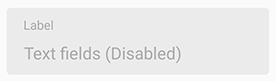
在 xml 中加入 app:enabled 或在 Java 代码中使用 setEnabled(boolean enabled)。
<studio.carbonylgroup.textfieldboxes.TextFieldBoxes
    ...
    app:enabled="false"
    >
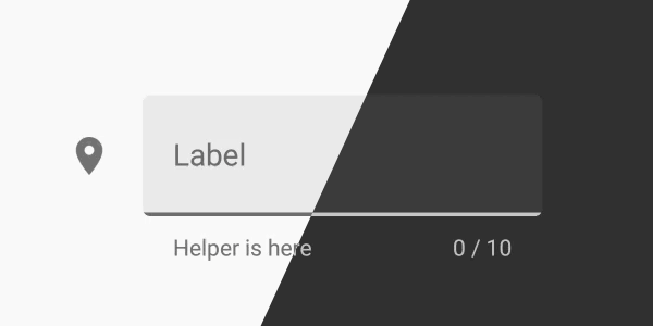
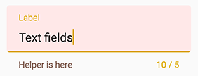
注意: 将帮助或错误信息设置为任何不为空的字符将会使底部 View (包含了帮助标签) 可见并增加 TextFieldBoxes 的高度。所以如果你想让底部 View 始终可见 (保持增加后的高度),则可在帮助标签应为空时将其设为 " " 。
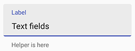
在 xml 中加入 app:helperText 或在 Java 代码中使用 setHelperText(String helperText)。
<studio.carbonylgroup.textfieldboxes.TextFieldBoxes
    ...
    app:helperText="Helper is here"
    >
在 Java 代码中使用 setError(String errorText, boolean giveFocus)。
giveFocus 参数决定被设置错误的文本域是否获得焦点。如果为 true,则该文本域立即获得焦点。
注意: 文本改动 (输入或删除) 时会自动清除错误信息。
setError("Error message");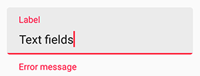
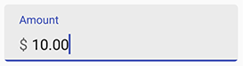
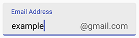
!注意: 前缀与后缀应在 ExtendedEditText 中设置。
在 xml 中加入 app:prefix 或在 Java 代码中使用 setPrefix(String prefix) 以设置文本域前端的前缀。
在 xml 中加入 app:suffix 或在 Java 代码中使用 setSuffix(String suffix) 以设置文本域末端的后缀。
<studio.carbonylgroup.textfieldboxes.ExtendedEditText
    ...
    app:prefix="$ "
    >
<studio.carbonylgroup.textfieldboxes.ExtendedEditText
    ...
    app:suffix="\@gmail.com"
    >
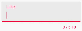
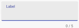
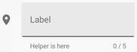
注意: 设置最大或最小字符数将会使底部 View (包含了计数标签) 可见并增加 TextFieldBoxes 的高度。
在 xml 中加入 app:maxCharacters 或在 Java 代码中使用 setMaxCharacters(int maxCharacters) 以设置最大字符数。在 Java 代码中使用 removeMaxCharacters() 以移除限制。
在 xml 中加入 app:minCharacters 或在 Java 代码中使用 setMinCharacters(int minCharacters) 以设置最小字符数。在 Java 代码中使用 removeMinCharacters() 以移除限制。
当超出字符数限制时底部的线会变成 errorColor(默认为红色)。默认值是 0, 表示没有限制。
注意: 空格和换行不计入字符数。
<studio.carbonylgroup.textfieldboxes.TextFieldBoxes
    ...
    app:maxCharacters="10"
    app:minCharacters="5"
    >
<studio.carbonylgroup.textfieldboxes.TextFieldBoxes
    ...
    app:maxCharacters="5"
    >
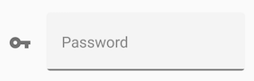
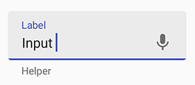
在 xml 中加入 app:iconSignifier 或在 Java 代码中使用 setIconSignifier(Int resourceID) 以设置 TextFieldBoxes 前边的图标(如果你想要有)。
你可以在 Java 代码中使用 setIsResponsiveIconColor(boolean isrResponsiveIconColor) 以设置首图标是否会和标签文本与底部的线一样在获得或失去焦点时改变颜色。
注意:如果值为 true,图标颜色将始终为 HighlightColor (与底部的线一样),即在失去焦点时将会变灰。如果为 false,图标颜色将始终为 primaryColor。
<studio.carbonylgroup.textfieldboxes.TextFieldBoxes
    ...
    app:iconSignifier="@drawable/ic_vpn_key_black_24dp"
    >

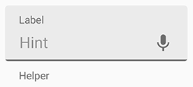
在 xml 中使用 app:endIcon 或在 Java 代码中使用 setEndIcon(Int resourceID) 以设置文本域末端的 ImageButton 的图标(如果你想要有)。
<studio.carbonylgroup.textfieldboxes.TextFieldBoxes
    ...
    app:endIcon="@drawable/ic_mic_black_24dp"
    >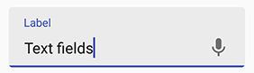
为了让它有点用(触发语音输入、下拉事件), 你需要在 Java 代码中使用 getEndIconImageButton() 以设置, 举个例子, 点击时的事件 (.setOnClickListener()), 或者其他的需求。
final TextFieldBoxes textFieldBoxes = findViewById(R.id.text_field_boxes);
textFieldBoxes.getEndIconImageButton().setOnClickListener(new View.OnClickListener() {
    @Override
    public void onClick(View view) {
        // 点击时的事件
    }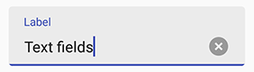
});在 xml 中使用 app:hasClearButton 或在 Java 代码中使用 setHasClearButton(boolean hasClearButton) 以设置是否显示清除按钮。
如果为 true, 每当文本域中有字符输入时(任何字符)末端将会显示清除按钮。
<studio.carbonylgroup.textfieldboxes.TextFieldBoxes
    ...
    app:hasClearButton="true"
    >
Primary Color 是底部的线、标签文字和首图标在获得焦点时的颜色。在 xml 中加入 app:primaryColor 或在 Java 代码中使用 setPrimaryColor(int colorRes) 以设置。默认值为目前主题的 Primary Color。
Secondary Color 是底部的线、标签文字和首图标在失去焦点时的颜色。在 xml 中加入 app:secondaryColor 或在 Java 代码中使用 setSecondaryColor(int colorRes) 以设置。默认值为目前主题的 textColorTertiary。
Error Color 是出现错误时显示的颜色 (e.g. 超出字符数限制, setError())。在 xml 中加入 app:errorColor 或在 Java 代码中使用 setErrorColor(int colorRes) 以设置。默认值是 A400 red。
Helper Text Color 是帮助文本的颜色。在 xml 中加入 app:helperTextColor 或在 Java 代码中使用 setHelperTextColor(int colorRes) 以设置。默认值是 54% black。
Panel Background Color 是文本框背板的颜色。在 xml 中加入 app:panelBackgroundColor 或在 Java 代码中使用 setPanelBackgroundColor(int colorRes) 以设置。默认值是 6% black。需要注意的是根据规范,默认的颜色是 6% 透明度的黑色 (#000000),所以如果你要自定义颜色并且仍需让其保持透明,则应同样设置一个带透明度的颜色。
<studio.carbonylgroup.textfieldboxes.TextFieldBoxes
    ...
    app:primaryColor="#1B5E20"
    app:errorColor="#ddaa00"
    app:helperTextColor="#795548"
    app:panelBackgroundColor="#ffe8e8"
    >
Ripple Color 是当 View 被点击时波纹效果的颜色。 在 styles.xml 中加入以下代码:
<style name="TextFieldBoxes">
    <item name="android:colorControlHighlight" tools:targetApi="lollipop">YOUR_COLOR</item>
</style>
然后将此设为你 TextFieldBoxes 的 Theme:
<studio.carbonylgroup.textfieldboxes.TextFieldBoxes
    ...
    android:theme="@style/TextFieldBoxes"
>你可以使用更小的元素纵向间距,让文本框的布局更加紧凑,以在某些情况下改善用户体验。
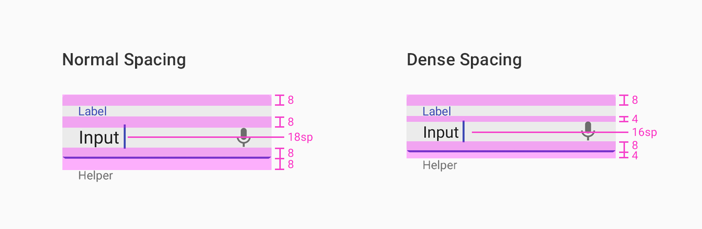
在 xml 中加入 app:useDenseSpacing 或在 Java 代码中使用 setUseDenseSpacing(boolean useDenseSpacing),以设置是否使用更小的间距。
<studio.carbonylgroup.textfieldboxes.TextFieldBoxes
    ...
    app:useDenseSpacing="true"
    >
有些时候,你可能需要在顶部标签与提示 (Hint) 文本中显示不同的内容, 并且不希望提示文本在失去焦点时被标签盖住。
你可以在 xml 中加入 app:alwaysShowHint 或在 Java 代码中使用 setAlwaysShowHint(boolean alwaysShowHint),以设置当 EditText 中有提示文本时,是否将标签始终固定在顶部。
<studio.carbonylgroup.textfieldboxes.TextFieldBoxes
    ...
    app:alwaysShowHint="true"
    >
强烈建议使用 setSimpleTextChangeWatcher() 来监听文字输入,而不是 addTextChangedListener()。
这有以下好处:
- 不需要时,可以不用实现
beforeTextChanged()andonTextChanged()方法。 - 保证你的代码在默认进程结束(去除错误状态,更新计数文本等)后执行,从而避免可能的无法预料的问题。
- 不需要在视图回收后手动调用移除函数。
比如:
final TextFieldBoxes textFieldBoxes = findViewById(R.id.text_field_boxes);
textFieldBoxes.setSimpleTextChangeWatcher(new SimpleTextChangedWatcher() {
    @Override
    public void onTextChanged(String theNewText, boolean isError) {
        // What you want to do when text changes
    }
});TextFieldBoxes 用目前主题中的颜色属性因此将自动改变颜色以适应暗主题而不需其他设置。

默认情况下,文本框的错误状态将在初始化和文本变化时更新。这将导致在设置了最小字符限制时,文本框将在初始化时处于错误状态。
将 app:manualValidateError 设置为 true,将使错误状态只在调用 validate() 时刷新。
<studio.carbonylgroup.textfieldboxes.TextFieldBoxes
    ...
    app:manualValidateError="true"
    >
final TextFieldBoxes textFieldBoxes = findViewById(R.id.text_field_boxes);
// 错误状态只在调用这个时刷新
textFieldBoxes.validate()
| 属性 | 描述 |
|---|---|
app:prefix |
前缀文本 |
app:suffix |
后缀文本 |
| 属性 | 描述 | 默认值 |
|---|---|---|
app:prefixTextColor |
前缀文本颜色 | 目前主题 textColorTertiary |
app:suffixTextColor |
后缀文本颜色 | 目前主题 textColorTertiary |
| 属性 | 描述 |
|---|---|
app:label |
顶部的标签文本 |
app:helperText |
底部的帮助文本 |
| 属性 | 描述 | 默认值 |
|---|---|---|
app:helperTextColor |
帮助文本颜色 | 目前主题 textColorTertiary |
app:mCounterTextColor |
计数文本颜色 | 目前主题 textColorTertiary |
app:errorColor |
错误时的显示颜色 (e.g. 超出字符限制, setError()) |
A400 red |
app:primaryColor |
底部的线、标签文字和首图标在获得焦点时的颜色 | 目前主题 colorPrimary |
app:secondaryColor |
底部的线、标签文字和首图标在失去焦点时的颜色 | 目前主题 textColorTertiary |
app:panelBackgroundColor |
文本框背板的颜色 | 6% 目前主题 colorForeground |
| 属性 | 描述 | 默认值 |
|---|---|---|
app:iconSignifier |
TextFieldBoxes 前边的图标的资源 ID | 0 |
app:endIcon |
文本域末端的图标的资源 ID | 0 |
app:isResponsiveIconColor |
首图标是否会和标签文本与底部的线一样在获得或失去焦点时改变颜色 | True |
| 属性 | 描述 | 默认值 |
|---|---|---|
app:maxCharacters |
最大字符数。0 表示没有限制 |
0 |
app:minCharacters |
最小字符数。0 表示没有限制 |
0 |
| 属性 | 描述 | 默认值 |
|---|---|---|
app:enabled |
文本框是否启用 | True |
app:hasClearButton |
是否在文本域末端显示清除按钮 | False |
app:hasFocus |
文本框是否获得焦点 | False |
app:alwaysShowHint |
当 EditText 中有提示文本时,是否将标签始终固定在顶部 | False |
app:useDenseSpacing |
是否使用紧凑的布局 | False |
app:manualValidateError |
错误状态是否只在调用 validate() 时刷新 |
False |
Copyright 2020 Mark Wang

Licensed under the Apache License, Version 2.0 (the "License");
you may not use this file except in compliance with the License.
You may obtain a copy of the License at

    http://www.apache.org/licenses/LICENSE-2.0

Unless required by applicable law or agreed to in writing, software
distributed under the License is distributed on an "AS IS" BASIS,
WITHOUT WARRANTIES OR CONDITIONS OF ANY KIND, either express or implied.
See the License for the specific language governing permissions and
limitations under the License.