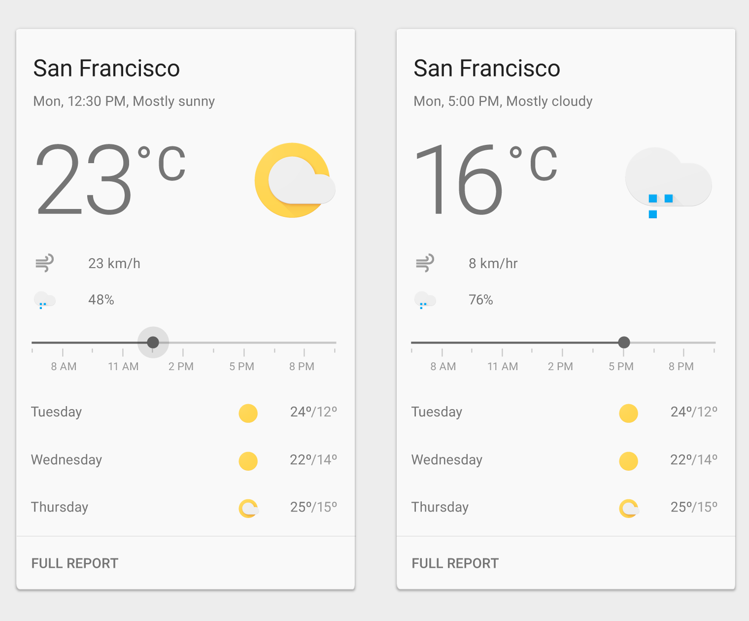
Android Material Design CardView general template designed by Rajat Gupta
A card is a sheet of material that serves as an entry point to more detailed information. Cards may contain a photo, text, and a link about a single subject. They may display content containing elements of varying size, such as photos with captions of variable length.
Cards are a convenient means of displaying content composed of different elements. They’re also well-suited for showcasing elements whose size or supported actions vary, like photos with captions of variable length.
Cards provide context and an entry point to more robust information and views, and their content and quantity can vary greatly. Cards within a card collection can each contain a unique data set, such as a checklist with an action, a note with an action, and a note with a photo.
Don't overload cards with extraneous information or actions.
Content hierarchy
Use hierarchy within the card to direct users’ attention to the most important information. For example, place primary content at the top of the card, or use typography to emphasize primary content.
Images can reinforce other content in a card. However, their size and placement within the card depends on whether images are the primary content or are being used to supplement other content on the card.
Text is most legible when placed on a solid color background with a sufficient contrast ratio to the text. Text placed on image backgrounds should preserve text legibility.
Cards have a constant width and variable height. The maximum height is limited to the height of the available space on a platform, but it can temporarily expand (for example, to display a comment field).
Cards do not flip over to reveal information on the back.
Card gestures should be consistently implemented within a card collection.The swipe gesture may be used on a per-card basis. Limit swipe gestures within a view so that they don’t overlap with one another. For example, a swipeable card should not contain a swipeable image carousel, so that only a single action occurs when the card is swiped. The pick-up-and-move gesture may be used if it is important for the user to be able to sort cards within a collection. But consider if filtering or sorting would better organize the content.
Card collections can be programmatically sorted or filtered by date, file size, alphabetical order, or other parameters.
The first item in the collection is positioned at the top left.
The order proceeds left to right and top to bottom.
Card collections only scroll vertically.
Card content that exceeds the maximum card height is truncated and does not scroll, but the card can be expanded. Once expanded, the card may exceed the maximum height of the view. In this case, the card will scroll with the card collection.


